

Given the ongoing protests against new North American pipeline construction, we at Agility PR Solutions thought now would be a perfect time to look back at the energy year that was.
We found that, between the Standing Rock protests, the election of Donald Trump, and the Canadian federal government recently ruling in favour of two controversial projects, 2016 reignited the North American pipeline debate with a vengeance.
Using data mined from our patented Agility Enterprise software, we found that mentions of “pipeline” in U.S. and Canadian media jumped more than 200 per cent in the final six months of 2016.
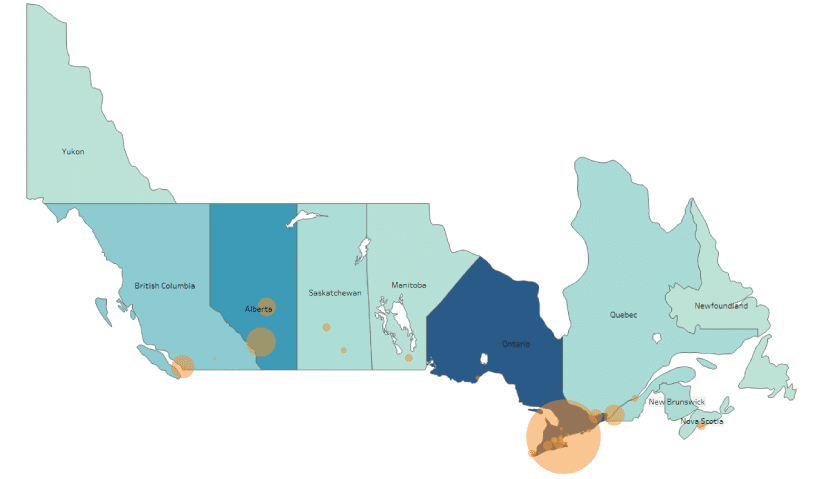
We’ve heat-mapped the dispersion of pipeline-related stories across North America, to illustrate exactly where coverage is being generated.
Unsurprisingly, the bulk of coverage in Canada was generated in Ontario (population) and Alberta (oilsands), with Toronto, Calgary, and Edmonton producing the largest circulation in print and online news articles. Vancouver and Saint John, N.B. also produced notable coverage spikes, no doubt from those centres’ involvement in the Trans Mountain and Energy East pipelines.
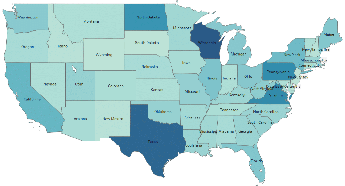
The following graphs represent each state/province from lightest to darkest, based on article volume, with darkest being the most active.
In Canada, the publication circulation of major cities is represented in orange.
Canadian coverage heat map (2016)
In the U.S., North Dakota’s sizable coverage output is noteworthy – especially relative to the state’s low population – and was partially the result of prolonged protests against the Dakota Access Pipeline.
Wisconsin also produced a disproportionate amount of pipeline-related coverage last year, due to its proximity to the Dakota Access and Keystone XL Pipelines, as well as the state’s involvement with Enbridge’s Sandpiper Pipeline.
As the major terminus of the Keystone pipeline, as well as being home to the country’s largest refineries, Texas was also a top producer of pipeline content in 2016.
U.S. coverage heat map (2016)
U.S. pipeline network
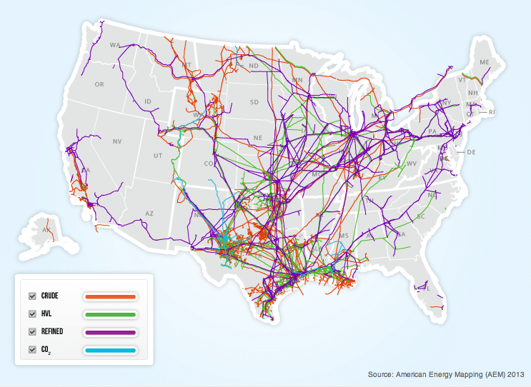
Source: http://www.aopl.org/pipeline-basics/pipeline-maps/
Interesting to note is the distribution of content across areas not typically thought of as oil states, such as the Northeast and Eastern Midwest.
But when compared with a map showing active pipelines, coverage in areas such as Illinois, Ohio, Michigan, and Pennsylvania is no surprise. Time will tell if the trends remain the same in 2017.
This type of data gathering and visualization is just one example of how Agility PR Solutions simplifies the communications lifecycle.