To spread the message about their business, generate more sales and reach more customers, companies regularly aim to create compelling public relations plans. These are complex strategies that require a lot of creative and critical thinking, smart budgeting, strategic planning, and an ability to eliminate issues as they appear.
The PR campaign is the public-facing component of this plan that manages the way a company interacts with the public. Clearly, a lot of thought is given to any strategy, method and tactic here.
But modern marketing is too complex to be clearly described in written briefs and marketing plans. The industry has been developing rapidly in the recent decade, with new technologies and methods materializing at an incredible rate.
Diagrams play an important role in designing multi-channel campaigns because they are a useful visual aid that can improve the understanding of the information.
Why use diagrams?
Everyone knows that a picture is worth a thousand words. Marketers and PR professionals agree with this saying because they need visual aids to communicate concepts, ideas and strategies.

If one wishes to establish a powerful marketing infrastructure and persuade stakeholders to support the project, one needs to utilize diagrams in order to document marketing strategies and systems.
The reason for using diagrams is really simple: they can take the most complex process or system and make it easy to understand for potential customers and stakeholders.
Here are some tips on how to use diagrams in PR campaign plans:
Data visualization
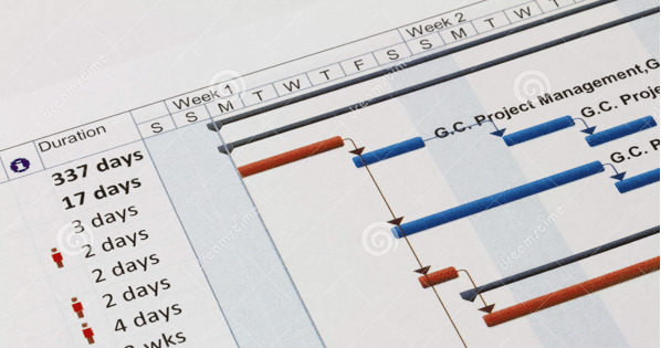
One does not have to work in the PR industry to know how complex PR campaigns are. There are so many moving parts that need to be considered and documented, it is ridiculously easy to overlook something important during the analysis and implementation.

Image Credit: dreamstime.com
A typical PR campaign plan contains a lot of elements, including strategies to reach certain target audiences, means of attracting attention, landing points, description of all included process, and lots more.
By using a diagram, PR professionals are able to capture and convey all primary and secondary information as well as anything else. Moreover, diagrams allow to accomplish this in a very efficient way. For example, ten pages of text can be easily combined into several diagrams.
As the result, presenting the information in the form of a diagram can communicate information much more effectively, especially for those who are visual learners (by the way, they comprise around 65 percent of the Earth`s population!)
Enabling other to make decisions
Another great advantage of using diagrams for PR campaign plans comes from the need to personalize and automate. The vast majority of businesses use at least one form of marketing automation today to improve the efficiency of operations and develop relevant content.
For PR professionals, these operations also are critical because the information gathered by surveys and automation tools can be useful for creating campaigns. However, the lead nurturing workflows develop and age with time.
As the result, it becomes more difficult to hold on to all information useful for PR professionals. Explaining this information for others, including stakeholders, is getting harder as well.
Diagrams can eliminate this problem. By diagraming all information, PR professionals allow other to make their contribution in making decisions and enable them to make important decisions in their absence.
“Diagrams have helped me to understand PR data at least several times,” says Derrick Malone, a copywriter from Assignment Helper. “When our PR guys are absent, they are one of the few ways that help me to understand complex data.”
For example, flow diagrams that visualize initial conditions, the past, current, and future actions, decisions, and possible outcomes are incredibly useful for this.
Making information attractive to media
Diagrams offer a beautiful representation of textual data. Therefore, they can be used to visualize information for the press release and other media. For example, PR professionals can create case studies with effective visual aids to present real-world examples and benefits of using the services of the company.
As the result, case studies will be more attractive to media and customers (once again, many of them are visual learners).
Tracking deadlines
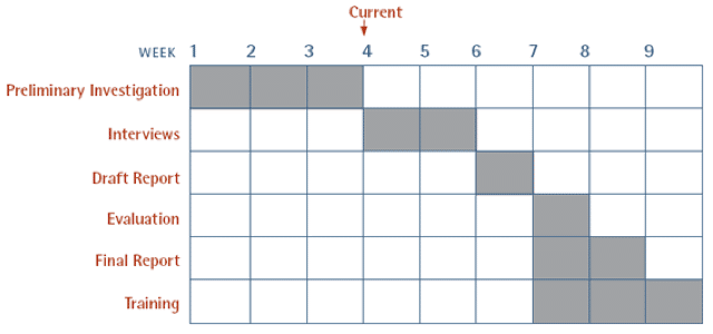
Gantt diagrams are one of the types of diagrams commonly used by PR professionals to show a scheduled beginning and completion of each part of a campaign plan. They provide a visual representation of schedule in order to plan, coordinate, and track particular tasks in a project.
This type of diagrams is constructed by using diagonal axis that represent the complete duration of the project broken down into specific times (e.g., days, weeks, and months). PR professionals include all information about completed, current, and future tasks, and assign people to them.

Image Credit: cuttingedgepr.com
The image above represents the simplest model of the Gantt diagram with examples of tasks along with deadlines. It can be turned into rich project visualization tool that allows tracking performance of all related tasks.
Diagram your way to PR success
PR professionals today face enormous challenges and tight deadlines. Diagrams are one of the ways they can accomplish tasks in an efficient manner and improve understanding of data by investors and stakeholders.


