

Calls to action (CTAs) are one of the best ways to tell your readers exactly which desired action you’d like them to take. However, the biggest challenge for any marketer is to make CTAs convert-worthy.
Truth be told, the answer to “how to maximize CTA conversion rates” varies from company to company.
Why? Your relationships with your target audience, customer demographics, talking styles, priorities, and customer preferences all differ.
Even still, there are some best practices and tried-and-tested formulas we can adopt to boost the average conversion rates of our CTAs.
On that note, let’s dive in to find out what makes a great CTA. We’ll cover the different types of CTAs and outline six tips for creating high-converting CTAs.
To wrap it up, we’ll leave you with some outstanding CTA examples that’ll help you get inspired.
What makes a great CTA?
A great CTA has it all—from visual appeal to an offer the reader can’t resist to the right wording that makes the prospect click.
If you’re looking to create a great CTA, here are all the attributes you should tick-mark on your checklist:
- Clear and concise language (that’s action-oriented)
- Sense of urgency or scarcity
- Highlighted benefits
- Stunning visuals
Ideally, before creating a CTA, dive into audience research to learn:
- How do they communicate (e.g., are there certain jargon or lingo they use in their daily communication)?
- What are the top priorities or factors that’ll make them click (alternatively, what’ll prevent them from clicking)?
Types of CTAs
Just for reference, here are the types of CTAs you can consider adding to your site or using for your business:
- Buttons: A call to action button is the most common CTA that even website builders have incorporated as an essential element. For example, it could look something like this:
- Forms: Gated content usually uses forms as CTAs. If you fill out the form, you can access the content on the site.
- Banners: You’d usually find these CTAs in the corner of a company’s web page or at the bottom of a blog post. For example, here’s what banner CTAs can look like in the wild:
- Contextual Links: These links are usually in the content material (e.g., blogs) of company websites, and they take the reader to the landing page of your offer.
- Pop-Ups: These refer to the pop-ups you see on a website. In most cases, these pop-ups might also have a discount or a promotional offer to lure you into taking the desired action.
6 tips to create high-converting CTAs
Now that we’re done with the what and whys, this section will elaborate more on the six tips that’ll help you boost click-through rates.
1) Choose words strategically
The thing about CTAs is that they need to have the right offer that’s worded in the correct way to make a customer click on it.
For example, if you address customer pain points, use action-based language, and align your CTAs with search intent—the chances of it converting are much higher.
Try to follow best copywriting practices, such as:
- Use language that elicits emotion — if you use emotive words, they can drive the customer to take action. For example, non-profits always use emotive CTAs.
- Clear over clever messaging (i.e., even something simple like “Buy Now” works if it sends the message across).
- Research your customers’ preferences, challenges, and search intent before wording your CTAs.
- Use action-oriented verbs.
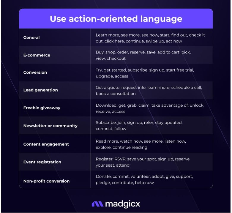
Source: Madgicx
2) Include personalization
Did you know that personalized CTAs perform 2x better than regular CTAs? In the real world, you can personalize your CTAs in a couple of distinct ways:
- Use your customer’s name on platforms where you can have a one-on-one conversion with your customer (such as emails, live chats, SMS, phone calls, etc).
- Personalize recommendations or offers. For example, if you offer a workplace tool that can be used by multiple industries, you can customize your offers and benefits to each industry. Or, if you run a newsletter and have a varied audience, you can segment your audience and share a customized version of the newsletter with everyone.
- Run localized ads or create dynamic content. For example, if you sell sunglasses with worldwide shipping and global customers, you can set up weather-triggered recommendations like, “Looks like it’s going to be hot in [City]. Beat the weather by buying sunglasses today!”
3) Show the solution you offer
In most cases, generic CTAs like “Sign Up” won’t perform as well as more targeted CTAs like “Sign up to access the newsletter.” So, it pays to mention the solution or benefit you’re offering to make prospects more likely to sign up.
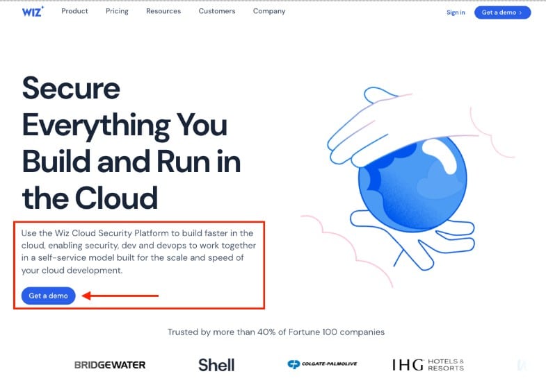
For example, Wiz uses its platform to give users actionable insights into their cloud security services, such as cloud security assessment, CSPM, and so on, by simplifying complex security tasks into clear, straightforward actions.
This approach acts as a potent CTA by offering immediate value to potential customers.
Users are more likely to engage with CTAs when they see a direct benefit, such as improving their cloud security with minimal effort. Wiz effectively leverages this by providing CTAs for demos that promise to showcase the comprehensive visibility and control over cloud workloads their platform offers.
Alternatively, you can also offer some social proof in your CTAs. For example, something like “Buy now to save 30%,” “Access the guide to know XYZ did XYZ,” or “Sign up to the newsletter with more than 12k subscribers” works well because it allows you to show the value you offer upfront.
You can also opt to mention your product’s USP to show what differentiates you, name-drop your customer list (e.g., “Folks from Netflix and OpenAI sign up to this newsletter”), or use attractive words that get customers excited to buy from you.
When in doubt, emphasize the advantage for the reader- in other words, what will they gain by clicking on your CTAs? Always think about what’s in it for them.
4) Aim for perfect placement

The positioning of your CTA can make or break conversion rates, particularly for e-commerce platforms.
You might ideally need the help of a UI/UX expert to nail down the specifics of what works and what doesn’t in terms of placement, but certain CTA placements are known to have higher conversion rates.
For example, research shows that CTAs in anchor text in blogs are known to have a 121% better chance of conversion. Alternatively, CTAs that are buttons also convert 45% better.
In some instances, companies have also gone through a more creative route to get customers to convert.
For instance, StudioSuits, a premier destination for bespoke attire, has implemented a savvy tactic on its custom tweed jackets page.
It has subtle but effective buttons that materialize upon hovering over product listings (these buttons also provide a closer look at the product fabric) — you’ll have to take a look at its page to find out how it does this.

5) Keep it simple
By keeping it simple, we mean:
- Tell the reader exactly which action you’d like them to take (e.g., buy, sign, book, etc.)
- Not using complicated language or jargon that confuses the reader
- Not using over-the-top buttons and other elements
- Being concise with your words
- Using simple site navigation
Always A/B test your CTAs to ensure maximum conversion rates. You can test out wording and colors and offer them at different intervals.
S3 backups can be instrumental in safely storing A/B testing data used to optimize your call to action (CTA) buttons. This allows you to revisit past iterations, analyze their performance, and make data-driven decisions for future CTAs, ultimately boosting conversion rates.
6) Use visual cues
Employing visual elements (e.g., arrows, buttons, or contrasting colors) strategically can draw attention to your CTA.
An example you can consider is Dyte’s iOS video SDK page. By incorporating arrows and shadow effects, Dyte’s CTAs stand out, guiding visitors’ attention toward the desired action.
Another neat tactic they employ is strategically placing multiple CTAs after each important section of their product page (i.e., faster value recognition = faster action).

When it comes to visuals, don’t only consider the placement or design but also consider optimization for different devices — i.e., is your CTA optimized for mobile phones, desktops, and other devices? Most people respond well to visuals, but people still need to see your CTA for them to have the desired effect.
4 Outstanding CTA examples
Need more inspiration? Take notes from these four stellar CTA examples.
1) Cruise America
Cruise America exemplifies a compelling Call to Action (CTA) strategy, particularly with their promotion of discounts on RV rentals.
They understand the importance of capturing attention from the moment you land on their website. A captivating image instantly transports you to the heart of an adventurer’s dream: an RV roading in a sunset and stunning location, similar to what travelers might look for when exploring RV rental Orlando options.
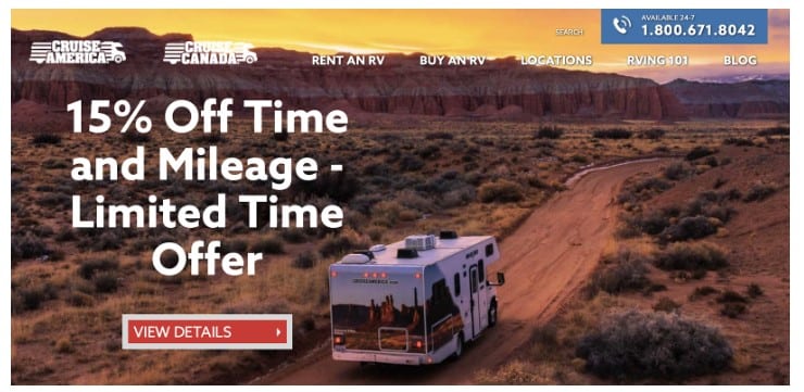
This powerful visual seamlessly integrates with the central focus: a clear and direct CTA button that reads “View Details.” This streamlined approach eliminates distractions and compels users to take the next step toward renting their perfect RV adventure vehicle.
2) Bani Kaur
This CTA by Bani Kaur provides plenty of social proof and shows the value her clients are going to get if they sign up for her services.

3) Ahrefs
Here’s another example by Ahrefs that comes across as an easy, digestible CTA that prefers communicating clearly.

4) H&R Block
And lastly, here’s a CTA example by HR Block that leverages scarcity tactics.
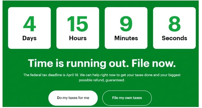
Leverage urgency or scarcity tactics to get customers to buy faster.
Wrap up
In this article, we covered what makes an effective CTA (coupled with a few outstanding examples) and a few techniques that will help your CTA stand out and increase your conversion rates.
On that note, we’ll end with a CTA of our own:
Our Social Proof: For many companies, like BairesDev, AgilityPR has identified key audiences and KPIs for reporting so we can conduct ongoing performance analysis and reporting. Through real-time analytics, we help our clients make data-driven decisions that ensure efficient, effective PR efforts.
Our Value: Our platform will help integrate generative AI into your PR process so you can deliver faster, smarter, more impactful PR communications.
Our CTA: Book a demo and speak to an expert at AgilityPR today!

