

PR’s Modern Dilemma: Pretty Dashboards, Ugly Delivery
In today’s world of media velocity and metrics-obsession, PR professionals rely on dashboards, sentiment analytics, and campaign reports as much as they rely on press relationships and storytelling. But while many platforms promise slick interfaces and stunning charts, what lies beneath is often brittle infrastructure, poor integration, or systems that fail to deliver when they’re needed most.
This blog is a call to arms: we can’t treat front-end beauty as a substitute for back-end brains.
We’ve all been dazzled by sleek PR tech stacks only to be left scrambling when reporting delays, data sync errors, or campaign collapses emerge behind the scenes. It’s not enough for PR tools to look good, but they must also work well under pressure. Front-end elegance must be matched by back-end endurance.
Let’s explore why, in 2025 and beyond, PR professionals must demand both front-end flash and back-end power in the tools we rely on.
Why “Good Enough” UX Isn’t Good Enough Anymore
PR Dashboards Are Now Business Dashboards
PR pros used to be the final stop in a communication chain, now we’re core to a brand’s data story. CMOs, CFOs, and even the board want to know what’s driving reputation, brand affinity, and campaign ROI. That means our reports aren’t just for show, but they’re fuel for strategic decisions.
When your platform loads slowly, crashes mid-report, or can’t scale to handle multiple campaigns, it undermines your credibility in the C-suite.
Your dashboard is your voice in the room. If it doesn’t deliver, you won’t be invited back.
Delight Can’t Compensate for Dysfunction
A slick user interface may earn points in a demo, but PR teams don’t live in demos, they live in crunch time. When you’re exporting campaign results an hour before a board review or parsing sentiment during a breaking crisis, latency and system bugs are career-altering liabilities.
Ask yourself: Does your tool just “look nice,” or does it actually perform?
The Hidden Problem: Weak Back-End Infrastructure in PR Tech
Beautiful UX Often Hides Technical Debt
We’ve entered the era of “pitch-first” SaaS, in which many PR tools race to market with flashy demos but duct-taped backends. These platforms may win initial buyers with good-looking interfaces, but they crumble under real-world stress.
Too many platforms:
- Use outdated APIs to pull media mentions.
- Run on a centralized architecture that can’t scale regionally.
- Lack automated QA for data inconsistencies.
- Provide near-real-time dashboards… that are actually refreshed manually.
This disconnect between UI polish and back-end rigor is annoying and dangerous. Inaccurate insights or broken reporting pipelines can lead to disastrous client outcomes or strategic missteps.
No System Design = No Trust
What most PR tools lack is thoughtful system design; the kind of infrastructure thinking that:
- Ensures data integrity across integrations.
- Anticipates failure and implements redundancy.
- Prioritizes scalability and concurrency during crisis communications.
- Supports localization, compliance, and uptime SLAs.
Without these foundations, platforms can’t evolve, adapt, or handle peak demand.
UX and System Design: A Symbiotic Relationship

What Users See Should Reflect What the System Knows
Here’s the truth: UX is only as good as the system design that supports it. When back-end data pipelines break, the front-end lies. And when you lie to users by showing outdated, missing, or wrong data, your platform loses all credibility.
Consider:
- A PR tool that shows a sentiment chart based on incomplete data.
- A media monitoring dashboard that says “all clear” during a reputation crisis.
- A campaign ROI tracker that forgets to include Instagram because its scraper failed silently.
These are failures in system design.
Beautiful charts built on brittle logic create risk, not value.
PR Campaigns Depend on Front-and-Back Alignment
You wouldn’t launch a campaign with great copy and zero distribution. So why use tools with great design but weak delivery?
Strong system design is like a well-built distribution strategy. It ensures that when your message lands, it’s accurate, complete, and timely. Every great campaign depends on:
- Timely data delivery.
- Stable integrations (CRM, social, news).
- Secure access controls for teams.
- Audit trails for accountability.
If your platform lacks those? It doesn’t matter how pretty the graphs are.
What Great UX + Solid System Design Looks Like in PR Tech

Let’s break this down into the 5 pillars that all PR tools should prioritize:
1. Real-Time Visibility with Resilient Infrastructure
A real-time dashboard that only works some of the time is worse than no dashboard at all. Back-end systems must include:
- Event-driven architecture for live data.
- Message queues (e.g., Kafka, RabbitMQ) to handle spikes in coverage.
- Caching and fallback protocols when APIs go down.
Front-end dashboards should also reflect this by clearly indicating data sources, refresh intervals, and integrity checks.
Best practice: Design dashboards to gracefully degrade when systems are under load. Let the user know when they’re seeing cached data. Honesty builds trust.
2. Seamless Integration with External Systems
PR platforms touch CRM, social listening tools, ad platforms, and media databases. If integrations aren’t robust and fault-tolerant:
- Data duplication happens.
- Critical mentions get lost.
- ROI metrics don’t match finance’s expectations.
System design tip: Use versioned, testable APIs and maintain sync protocols with recovery logs. Display integration status in your front-end.
UX tip: Let users re-sync manually and show last-sync times.
3. Predictable Performance Under Load
During crises or viral campaigns, your platform usage may spike 10x. Can your infrastructure handle:
- 100 concurrent users exporting reports?
- A 500% increase in monitoring volume?
- Real-time sentiment tracking across multiple regions?
If not, your system isn’t PR-ready.
System design solution: Use autoscaling infrastructure, load balancers, and observability tools.
UX follow-through: Avoid spinners that never finish. Instead, use timers, visual failover cues, and partial loading when possible.
4. Secure, Role-Based Access That Reflects Org Reality
Many PR tools treat access control as an afterthought. But in agencies and global teams:
- Clients need read-only access.
- Internal team members need campaign-specific rights.
- Crisis teams need full data traceability.
Without granular permissions and audit trails, trust and security collapse.
UX consideration: Users should see what they’re allowed to do, not just be silently blocked. Smart UX clarifies, not frustrates.
System design imperative: RBAC (Role-Based Access Control) must be deeply baked into the architecture, not added on later.
5. Strategic Reporting that’s Trustworthy and Actionable
The best PR tools help interpret data. But interpretation depends on trustworthy back-end data engineering.
- Are metrics weighted correctly?
- Are anomalies flagged and explained?
- Can you trace a campaign’s performance over time and correlate it with media moments?
UX enhancement: Use tooltips, explainers, “why am I seeing this?” buttons, and drill-downs to boost interpretability.
System requirement: Maintain metadata and processing logic documentation, and version your analytics models.
What Happens When PR Tools Ignore Back-End Strength
Let’s explore three real-world scenarios (anonymized) where PR teams were failed by tools with great UX but broken architecture:
Case 1: The Disappearing Dashboard
A global tech company was reporting campaign metrics to a regional VP during a major launch. Their dashboard, powered by a popular PR SaaS tool, suddenly dropped all metrics from Eastern Europe.
Cause? A back-end integration had rate-limited API access to a regional newswire.
Impact: The VP thought the region underperformed and reallocated budget elsewhere.
Takeaway: UX didn’t flag the data loss. A proper system design would have failed gracefully or alerted the user.
Case 2: Crisis, and the System Crashed
During a fast-moving product recall, a consumer brand’s PR team relied on a tool with live sentiment analysis. The UI promised real-time updates, but the platform buckled under increased traffic.
Social spikes couldn’t be ingested in time. Reports lagged by hours.
The result? The brand underestimated the backlash, and their reactive statements made things worse.
Case 3: One Click, Too Much Access
An agency client used a PR platform to share campaign previews with external stakeholders. Due to poor access controls, a junior team member accidentally edited a live campaign in progress.
The client caught it mid-pitch.
Embarrassment, finger-pointing, and trust erosion followed. A simple RBAC model and “view-only” UX could have prevented the fiasco.
What the PR Industry Needs to Demand in 2025
As PR pros become more tech-savvy, we must elevate our standards for the tools we adopt. Ask hard questions, not just about UX, but about system architecture:
- How does this tool scale?
- What happens when an API fails?
- How is data validated before display?
- What are the failure modes, and are users alerted?
- Is there transparency between what the UI shows and what the system knows?
If you wouldn’t trust your brand’s story to an intern with no training, don’t trust your data narrative to a pretty-but-broken platform.
UX is the tip of the iceberg. System design is everything beneath.
Final Thoughts: Why This Matters for PR Pros
PR is no longer just about creativity. It’s about clarity, credibility, and control. If we rely on tools that prioritize form over function, we jeopardize all three.
It’s time we demanded better. Tools should:
- Delight users without deceiving them.
- Tell stories backed by robust data, not shallow APIs.
Handle pressure with elegance, not collapse into latency and error messages.
In an age where insights drive strategy and speed drives relevance, your tools need to be as sophisticated as your team.
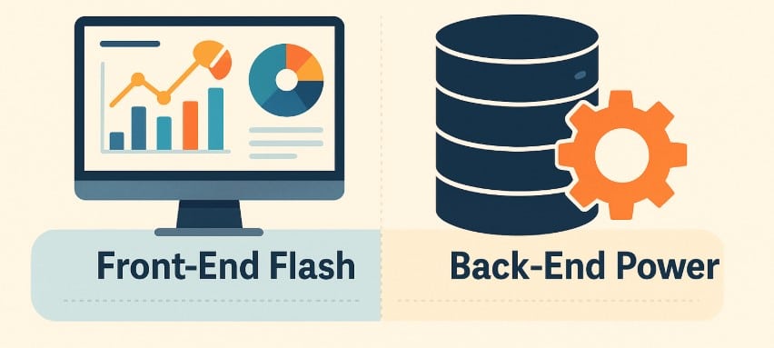
Front-end flash gets attention. Back-end power earns trust. Together, they create PR platforms worth believing in.

