

We read the first week of the 2026 tournament the way a newsroom does — then sorted every article into a map of what the coverage was actually about.
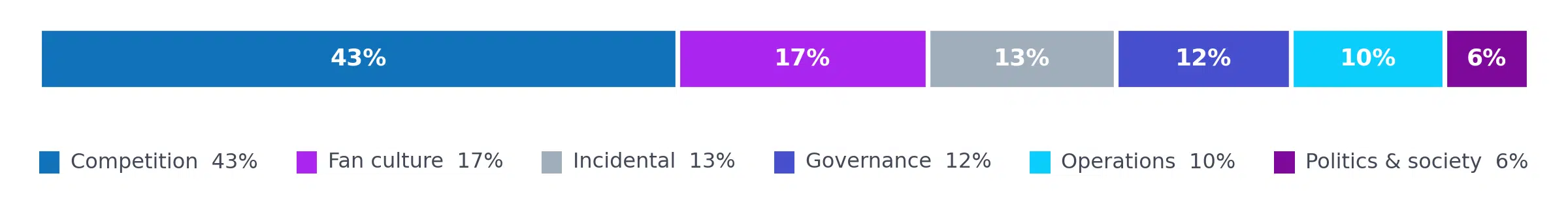
Share of first-week coverage, by topic
The matches are the obvious story. Across roughly 2,000 articles, on-field reporting — previews, recaps, scorelines, group-stage maths — was the single largest theme by a distance. Match results alone accounted for about three in ten of everything published.
But here is the part the headline number hides. Set aside the 253 articles where the World Cup was only incidental — local crime, credit-card roundups, anything that merely brushed past the tournament — and the genuine World Cup coverage splits almost exactly in half. The football itself is 49%. Everything around the football — the fans, the business, the logistics, the politics — is 51%. By article count, more of the conversation happened around the pitch than on it.
You can only see that split once the coverage has a shape. So we gave it one.
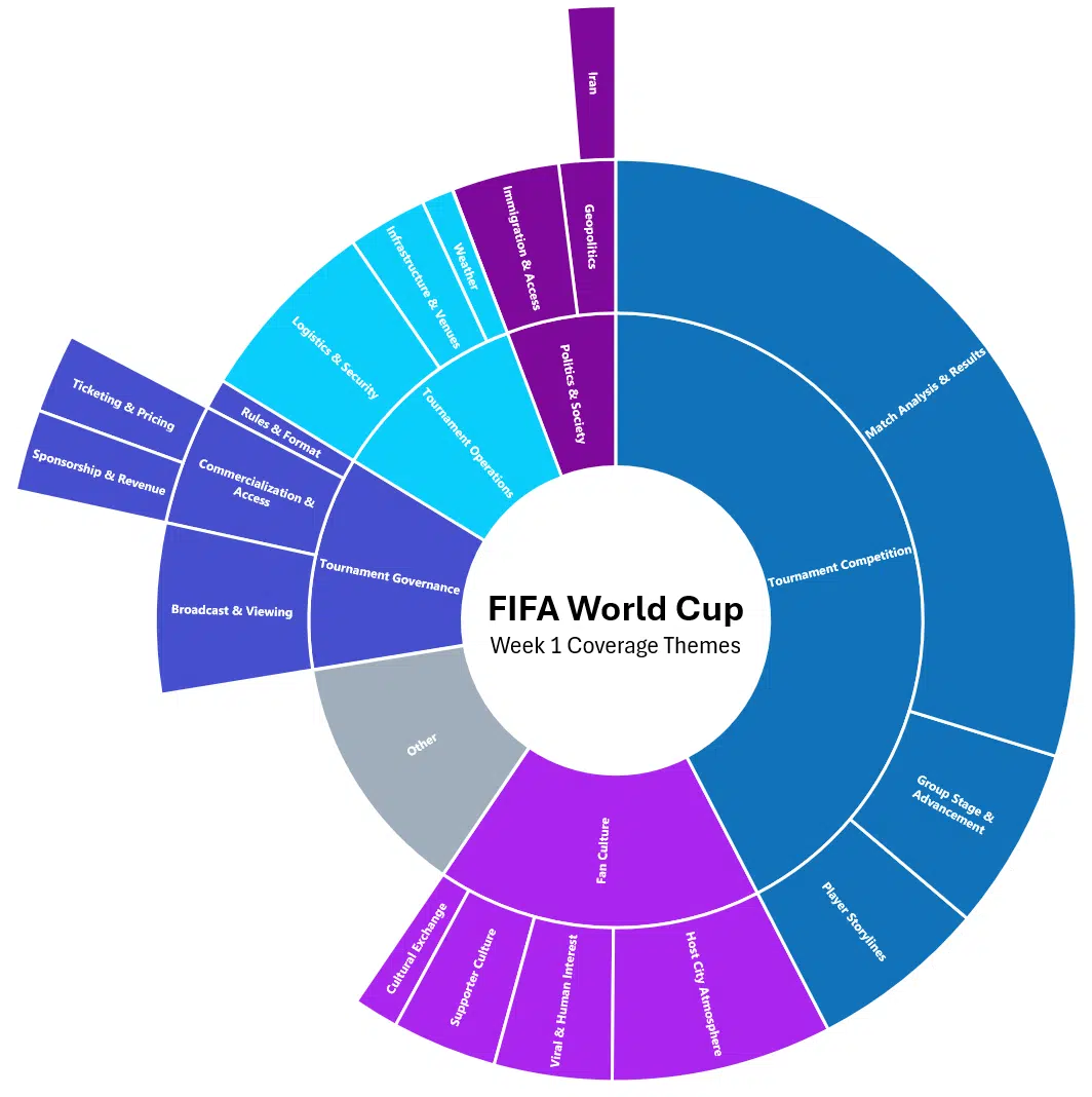
Each wedge is sized by how many articles fell under it. The centre is the whole sample; the first ring is the big narratives; the outer rings are the storylines beneath them.
Reading from the centre out
The structure does the explaining. Move outward from the core and the tournament stops looking like a results service and starts looking like a city — districts of attention, each with its own character.
- Tournament competition — 857 articles (43%). The engine room: who played, who won, who advanced. Match analysis was the biggest sub-branch in the entire dataset (583 articles), trailed by group-stage scenarios, breakout players and early-favourite power rankings.
- Fan culture — 336 (17%). The tournament as a shared ritual — host-city atmosphere, travelling supporters, jerseys and watch parties, and the viral oddities (Mexico City adopting Merlin the Duck; Norway’s Viking theme) that turn a match into a moment.
- Tournament governance — 235 (12%). Less about the game than about who controls and monetises it: where to watch, ticketing and resale scams, sponsorship and revenue, and rule-book flashpoints — the much-debated mandatory hydration breaks among them.
- Tournament operations — 206 (10%). The unglamorous machinery of staging a mega-event across three countries: transport and security, venue readiness, even the weather and the playing surfaces.
- Politics & society — 113 (6%). The smallest branch by volume, the highest-stakes by tone: visa denials, immigration access, protest, racism complaints and the geopolitics trailing Iran’s appearance. Small does not mean quiet — see below.
Why the map beats the word cloud
A flat list of top terms would have told us that tickets, fans, Messi and visas all showed up a lot. Useful, but flat. It can’t tell you whether “tickets” was really a story about resale fraud, fan access, commercialization or match-day logistics — or which storyline was a main artery versus a footnote.
The method, briefly
A hierarchy turns a pile of mentions into a structure you can brief from. That structural quality is what makes hierarchical topic modelling worth the extra effort for media intelligence. Three things a flat list can’t give you:
- Altitude on demand. An executive reads the inner ring — six themes, one glance. An analyst drills to the outer ring for the specific narrative. Same data, two entirely different briefings.
- Signal separated from noise. The taxonomy gave the 13% of incidental articles their own honest home in “Other,” so they stopped contaminating every share you quote. Frequency counts rarely cop to their own false positives.
- Context, not just count. The same keyword is filed by what the story is really doing. That’s the difference between knowing a word appeared and knowing what the conversation was.
One last reason structure matters: volume is not importance. Politics & society was the smallest branch on the chart, yet it held some of the loudest single stories of the week — the report of Ivory Coast’s Elye Wahi being denied entry to Canada reached an audience an order of magnitude larger than a routine match recap. A flat ranking by article count would have buried it near the bottom. The hierarchy keeps it visible as its own branch, where a strategist can weigh it on reach and risk rather than raw frequency.
That, finally, is the case for reading coverage as a map instead of a list. The first week of the World Cup wasn’t one story about soccer (football). It was a competition story, wrapped in a culture story, sitting on a business story, riding on an operations story, shadowed by a politics story — and the only way to manage all five at once is to be able to see them at the same time.
This analysis was conducted by Agility PR Solutions’ media intelligence team.

