
Every ecommerce business wants a website that attracts visitors, keeps them engaged, and turns them into customers.
That outcome depends on a series of smart decisions, from the way pages load and products are presented to how easily shoppers can complete a purchase. Each element shapes the overall experience and influences whether people stay, buy, and return.
High-performing ecommerce websites combine strong design with practical functionality. They make it easy to find products, compare options, trust the brand, and check out without friction. They also adapt to changing customer expectations, search engines, and devices, helping businesses stay competitive over time.
Here, we’ll cover the building blocks that support a successful ecommerce website. You’ll learn what matters most, why each component deserves attention, and how thoughtful improvements across your site can lead to better user experiences, stronger search visibility, and higher conversion rates.
Homepage Sections That Guide Visitors Toward the Right Products
Your homepage sets the direction for every visitor who lands on your website. People should immediately understand what you sell, who your products are for, and where they should click next.
A clear layout removes guesswork and encourages shoppers to keep exploring instead of leaving after a quick glance.
Research also suggests that intuitive navigation structures can increase user engagement by roughly 40%, highlighting the value of organizing information in a way that feels natural.
To build this kind of homepage:
- Group products into logical categories that reflect how customers shop.
- Place those categories in a clear navigation menu and support them with featured collections or best-selling products on the homepage.
- Add concise descriptions that explain who each category serves and include educational resources that answer common questions before visitors reach a product page.
- Keep important links visible, reduce unnecessary choices, and make search easy to find.
- Review your analytics regularly to locate pages where visitors leave, then refine your homepage structure to create smoother paths toward your most valuable products.
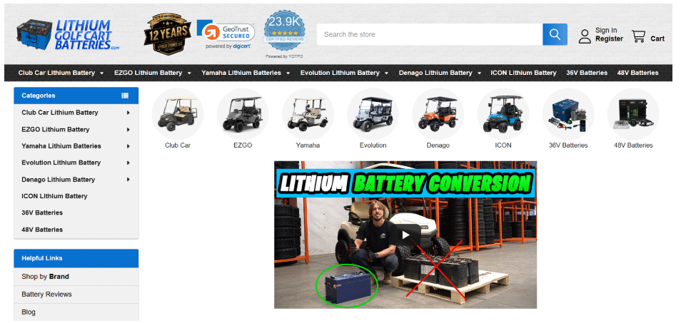
A strong example of this approach is LithiumGolfCartBatteries.com, a retailer selling lithium battery conversion kits for golf carts. Its homepage directs shoppers with clearly organized product categories, popular links in both the navigation and sidebar, featured products, and content that explains battery options and compatibility.
This way, you can look up the right product while learning enough to make informed decisions without feeling overwhelmed. Each section supports the next step, creating a straightforward buying journey that balances product discovery with helpful information.
This thoughtful organization helps customers move confidently from browsing to purchasing while reducing confusion throughout the shopping experience.
Source: lithiumgolfcartbatteries.com
A Hero Section That Immediately Captures Attention
The first few seconds on a page shape how visitors perceive your business.
A focused hero section gives people immediate context, explains your offer, and points them toward the next action. Clear messaging also reduces uncertainty, helping shoppers understand whether they’ve found the right solution before they start scrolling.
Every element should work together to create confidence and encourage further exploration.
To build an effective hero section:
- Craft everything around one primary message that explains what you sell and why it matters.
- Support that message with a short sentence that adds helpful context instead of repeating the headline.
- Include a prominent CTA that directs visitors toward shopping, requesting a quote, or learning more.
- Choose visuals that accurately represent your products or services and reinforce the message on the page.
- Remove competing buttons, unnecessary text, and distracting graphics that divide attention.
- Test different headlines, images, and CTAs over time to learn which combinations keep visitors engaged and generate stronger conversion rates.
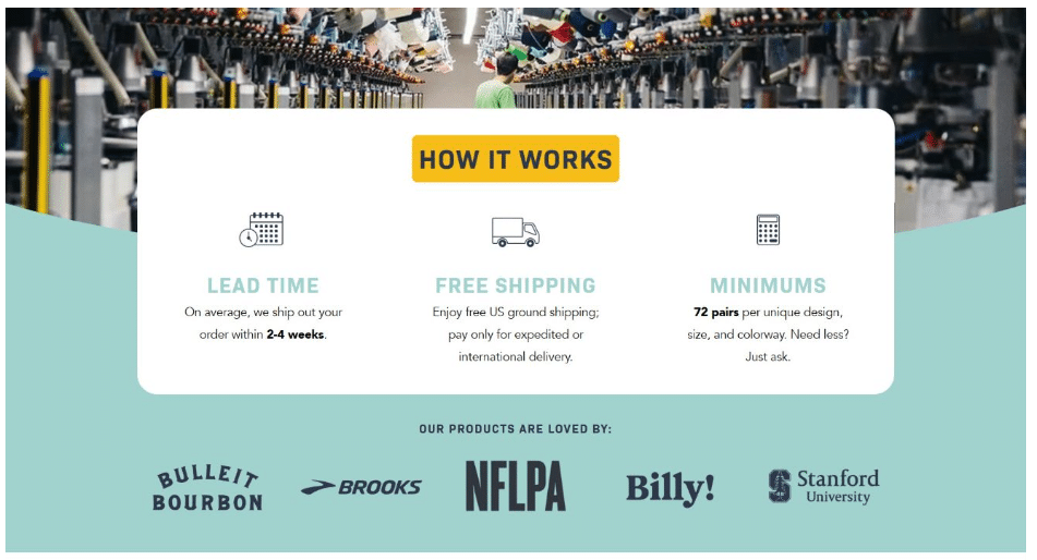
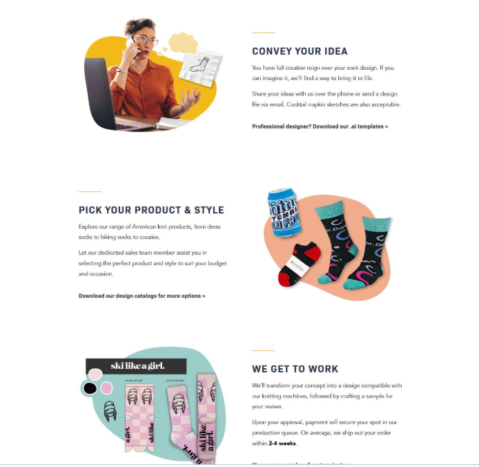
Custom Sock Lab, a company that designs custom socks for businesses, organizations, events, and individual customers, demonstrates this approach on its page explaining how the ordering process works.
The opening section immediately communicates what the company offers, outlines the production process in simple terms, and gives visitors a clear next step without filling the page with unnecessary information. Every element supports understanding, making the service feel approachable for first-time buyers while answering common questions early.
The result is a page that introduces a unique offer in a format that’s easy to follow, helping visitors stay focused and move confidently toward placing an order or requesting additional information.
Source: customsocklab.com
Collection and Category Pages That Encourage Product Discovery
Collection and category pages help shoppers explore your catalog with confidence. They organize products into meaningful groups, making it easier for visitors to compare options and discover items that match their needs.
A clear structure keeps people engaged for longer because every click feels purposeful and every product appears in the right context. Well-organized category pages also reduce friction by helping shoppers reach relevant products without relying entirely on the search bar.
To build collection pages that support discovery:
- Organize products into categories that reflect how customers naturally browse instead of how your inventory is managed internally.
- Use descriptive category names, clear product thumbnails, consistent pricing displays, and concise product summaries.
- Add filters for important attributes such as size, color, price, or material so visitors can narrow their options quickly.
- Keep product cards consistent across every category to create a predictable browsing experience.
- Sort featured or popular products near the top when appropriate, and review search data regularly to understand which categories deserve additional visibility or refinement.
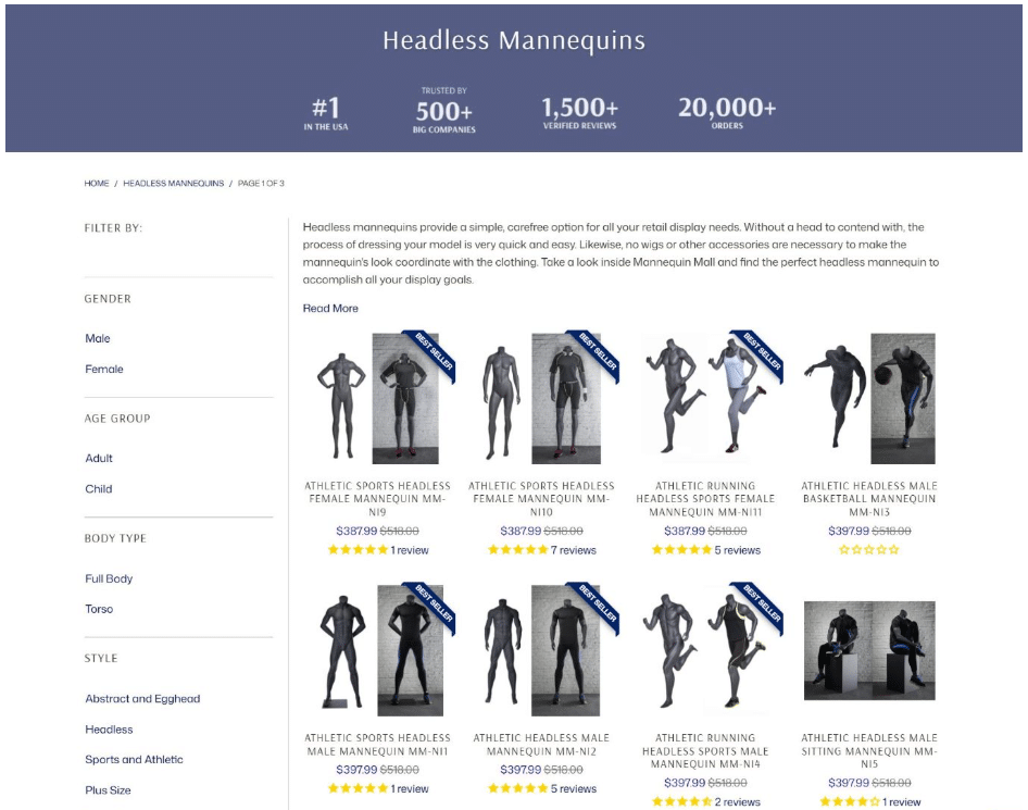
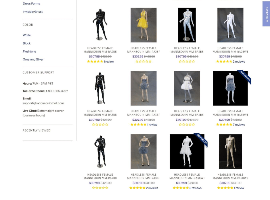
Mannequin Mall, a retailer selling fashion mannequins, demonstrates this strategy through its headless mannequin collection page. The page focuses on helping visitors browse efficiently, allowing products to take center stage without unnecessary distractions.
A logical layout, clear product hierarchy, practical filters, and consistent product cards make comparing different mannequin styles straightforward. Shoppers can quickly narrow their choices based on their specific display needs while maintaining a clear view of the available options. Every design decision supports product discovery and encourages visitors to continue exploring the catalog at their own pace.
This organized experience helps customers make informed purchasing decisions while reducing the effort required to find the right product.
Source: mannequinmall.com
A Consistent Visual Identity That Makes Every Page Feel Cohesive
Visitors form impressions about your brand long before they read every word on the page. A consistent visual identity creates familiarity, helping people recognize your business as they move between product pages, guides, landing pages, and checkout.
Consistency also strengthens trust because every interaction feels connected, intentional, and professionally presented. When every page follows the same design language, customers spend less effort adjusting to different layouts and more time engaging with your content.
To build visual consistency:
- Create clear brand guidelines for typography, colors, buttons, icons, spacing, and imagery, then apply them across your entire website.
- Keep headings, navigation, and CTAs visually consistent so visitors always know where to look.
- Use the same illustration style and photography approach throughout educational and commercial pages to maintain continuity.
- Review older content regularly and update pages that no longer match your current branding.
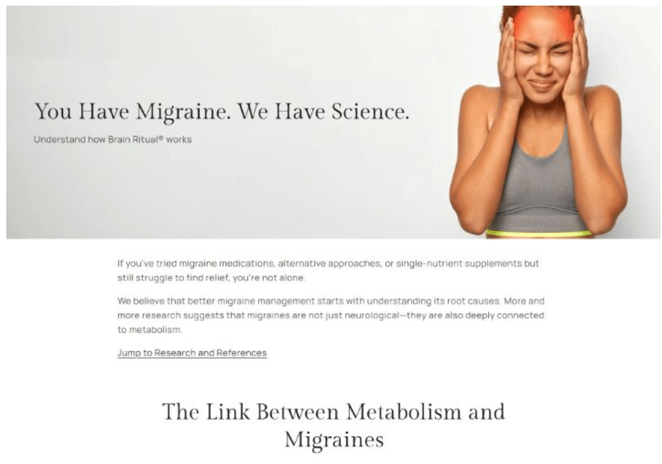
Brain Ritual, a company selling supplements that support brain health, energy metabolism, and performance for people managing migraines, shows this throughout its entire website.
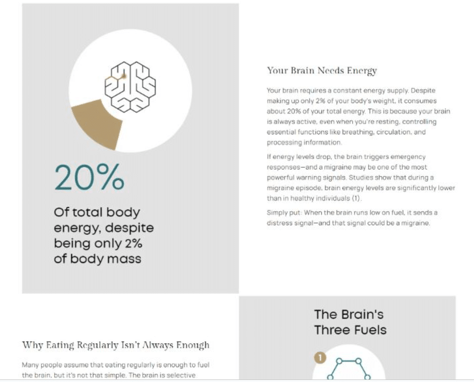
For instance, its landing page explaining the science behind Brain Ritual carries the same typography, color palette, illustrations, spacing, and overall design language found across the rest of the site.
The educational content feels like a natural extension of the shopping experience, making the transition between learning and purchasing smooth for visitors. Every visual element reinforces the brand while presenting complex information in a polished, approachable format.
This consistent presentation builds credibility, supports a stronger brand identity, and creates a user experience that remains familiar across every stage of the customer journey.
Source: brainritual.com
Product Photography and Visuals That Inspire Buyer Confidence
Product photography plays a major role in ecommerce because shoppers rely on images to understand products before making decisions.
More than 92% of shoppers say visuals are the top factor influencing their purchasing choices, showing how important strong imagery has become for online retailers. Clear, detailed visuals help visitors evaluate quality, compare options, and feel more comfortable moving toward checkout.
To strengthen your product photography:
- Invest in shots that show products from multiple angles and highlight important details customers need to see.
- Use consistent backgrounds, lighting, and image styles across your catalog to create a professional browsing experience.
- Include close-up shots, lifestyle images, or demonstrations when they help explain product features.
- Optimize image sizes so pages load quickly without sacrificing quality.
- Review your visuals regularly to replace outdated photos. A structured photography process makes it easier to maintain consistency as your product range grows.
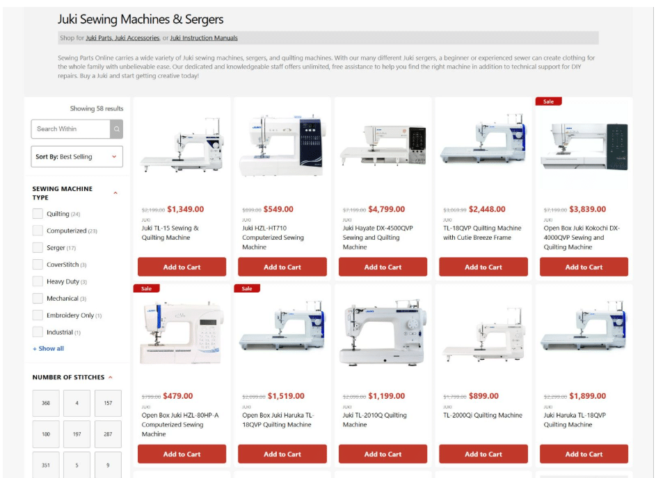
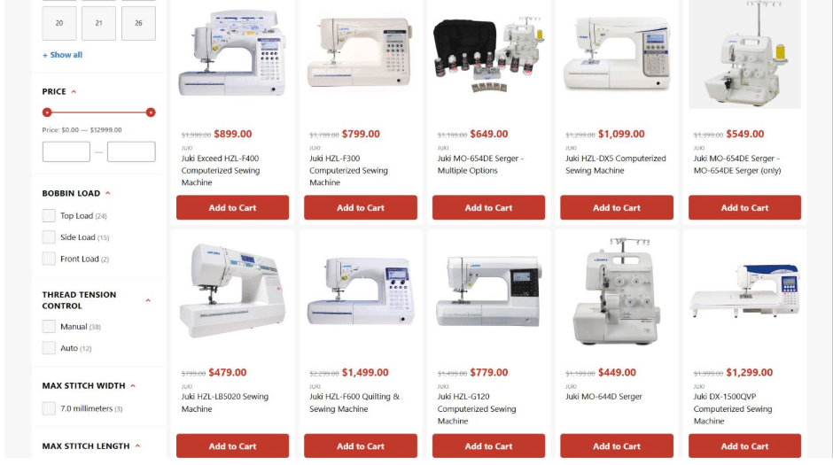
A brand that does this successfully is Sewing Parts Online, a retailer specializing in sewing machines, replacement parts, and sewing supplies. Its Juki sewing machines and sergers collection page uses high-quality, consistent product photography to help shoppers compare available options before exploring individual product details.
Each product image follows a clear presentation style, giving the catalog a polished and trustworthy appearance. Multiple angles and carefully displayed visuals allow visitors to understand the differences between machines and sergers with less effort.
This approach supports product discovery while giving shoppers the confidence they need to continue their journey through the website and find the equipment that matches their sewing needs. These visuals also help shoppers understand product differences faster and create a smoother online experience.
Source: sewingpartsonline.com
Checkout Pages Designed to Minimize Friction
A smooth checkout experience helps customers complete purchases without unnecessary delays or confusion.
Many shoppers leave when the final steps create obstacles, and around 70% of customers abandon their purchase if the checkout experience feels difficult. A simple, focused checkout process gives buyers confidence and keeps them moving toward completion.
To reduce friction on your checkout page:
- Remove unnecessary form fields, keep checkout pages easy to scan, and show important details clearly.
- Use a single-page layout when possible so shoppers can review their information, payment method, and order summary in one place.
- Offer guest checkout, autofill options, and trusted payment methods to speed up the process.
- Avoid distractions such as extra promotions or links that take visitors away from completing their order.
- Test your checkout flow regularly on different devices to identify problems that could cause hesitation or drop-offs.
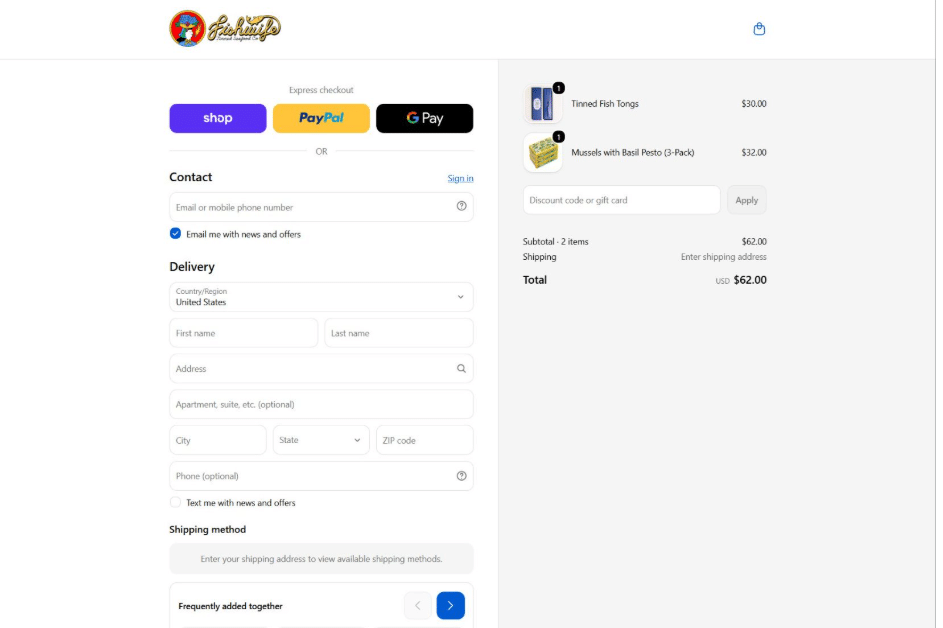
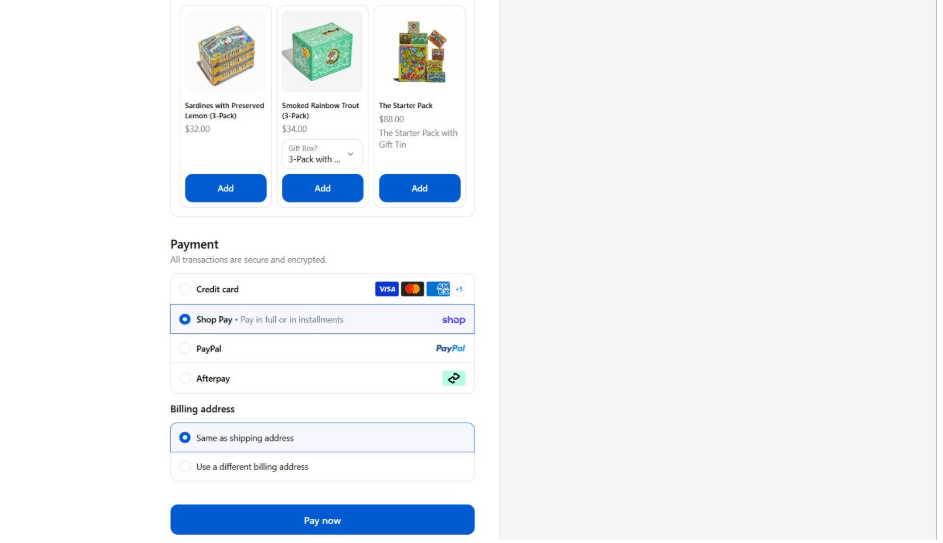
Fishwife, a brand offering ethically sourced, premium canned fish products, illustrates this method with its streamlined checkout design. Its single-page layout keeps shipping address, payment method, and order contents visible without hiding details behind a next step button.
Shoppers need to provide only basic information and click “Pay now” to finish the purchase. They’ve also included quick checkout options like Google Pay and PayPal, allowing customers with saved accounts to complete payments within seconds.
This creates a clean and confident checkout experience that reduces second-guessing and prevents unnecessary dropout points during the final stage of the buying journey. Its focused design shows how thoughtful checkout choices can help customers complete orders faster while maintaining clarity and trust throughout the process for every shopper across the online store today.
Source: eatfishwife.com
Final Thoughts
A high-performing ecommerce website comes from combining thoughtful design, clear structure, and a smooth customer experience. Every element, from the homepage and product pages to visuals and checkout, plays a role in helping visitors find what they need and complete their purchase with confidence.
Thriving ecommerce brands focus on removing confusion at every stage of the journey. They organize information clearly, present products effectively, and create consistent experiences that support both shoppers and business goals.
By improving these core building blocks, brands can create websites that serve customers better and adapt to changing expectations. Small improvements across navigation, content, visuals, and functionality can make a meaningful difference in how people interact with an online store.