

We’re in 2026, and the web has grown a bit of an attitude problem. It seems like it’s trying so hard to be “intelligent” that it’s become exhausting.
On the other hand, patience is scarce. People no longer tolerate friction, and they certainly won’t wait for a clunky menu to reveal itself or decode a clever but confusing layout.
We’ve all moved past the phase where quirky animations impressed anyone. Now, the only metric that matters is cognitive ease. You want someone to land on a page and simply know where to click without reading a manual.
That’s why we’ve distilled the current situation into the key elements that actually keep users on the page. These are the tangible, actionable components of interface design and interaction that define a smooth operation and reduce the effort required to get from point A to conversion.
Let’s look at what’s working right now.
Instant Clarity Above the Fold
The first screen a visitor sees on your website is the only one you’re guaranteed they’ll actually look at. Everything after that depends on what happens in those first few seconds.
If they can’t decode what you offer and whether it’s meant for them without scrolling or squinting, they won’t stick around to figure it out.
That’s why your headline, your visuals, and your layout need to point people toward the next step.
How to implement it
- Start by treating your headline as a filter, not a tagline. It should tell the right visitors they’re in the right place, and let the wrong ones leave quickly.
- Keep visuals product-focused and literal rather than decorative.
- Position your most important content, such as product categories, a core CTA, or a key differentiator, where users don’t need to scroll to find it.
- Run a five-second test. Show someone your page briefly and ask what the site sells. If they hesitate, the fold needs work.
Real-world example
Pergola Kits USA sells ready-to-assemble outdoor structures (pergolas, pavilions, and covered patio kits) shipped directly to homeowners across the country. Their patio cover kits category page is a great example of a fold that earns its keep.
This page has no introductory copy to wade through. Its heading tells you exactly what you’re looking at, and product listings start immediately below it, each one showing a photo, name, and price. There are no banners, no brand storytelling, and no prompts to explore before you’ve even seen what’s available.
A visitor who knows what they want can start comparing options within seconds of arriving.
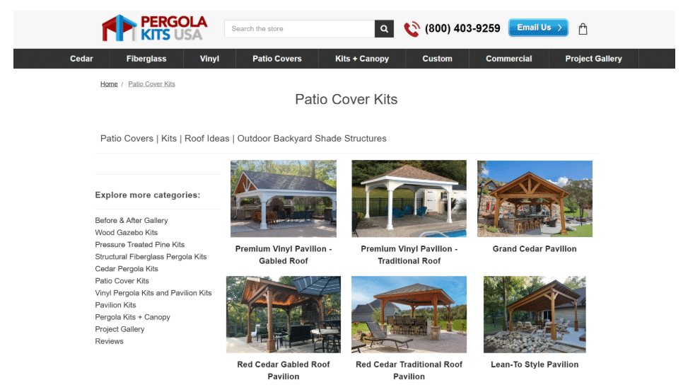
Source: pergolakitsusa.com
Effortless, Intuitive Navigation
A visitor who knows what they want shouldn’t hunt for it. That sounds obvious, yet countless sites still bury categories inside dropdown labyrinths and force users to click through six irrelevant pages before reaching the goods.
In 2026, navigation qualifies as intuitive only when it anticipates intent and collapses the distance between arrival and discovery.
The data backs this up with real weight. Implementing intuitive navigation structures can increase user engagement by roughly 40%. That’s because people reward simplicity with their attention. When filtering feels instantaneous and category logic mirrors how customers actually think about your offers, browsing transforms from a chore into something almost satisfying.
How to implement it
- Audit your current navigation by asking one uncomfortable question: How many clicks does it take to reach a specific product from your homepage?
- Halve that number.
- Build category labels around user vocabulary, not internal jargon.
- Enable robust filtering that lets visitors slice inventory by meaningful attributes, like price, popularity, style, material, or use case.
- Never bury the sorting dropdown. Keep it visible, responsive, and obvious.
Real-world example
Icecartel gets this right across their men’s moissanite jewelry site. Their chains category page hands visitors immediate control without any fuss.
There, you can sort by relevance, best-selling items, alphabetical order, or price range with a single tap. If you want to narrow further, you can filter by specific jewelry style and watch irrelevant options vanish.
What remains is exactly what you came to browse. The experience feels quick because the interface does the heavy lifting behind the scenes.
That’s frictionless navigation at work.
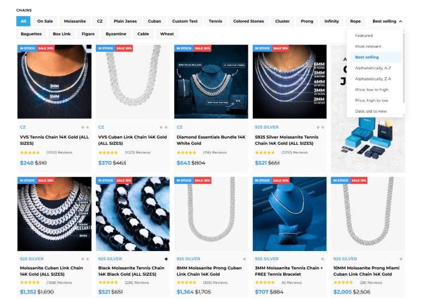
Source: icecartel.com
Intent-Driven Content Structure
Most websites suffer from a fundamental misunderstanding of why people visit them. They dump information onto pages in whatever order felt right during a Tuesday planning meeting.
That approach ignores the psychological sequence every visitor follows: curiosity, validation, trust, action. An intent-driven structure means arranging content to match that internal rhythm instead of fighting against it.
When sections flow according to user intent rather than departmental priorities, scrolling feels natural. The visitor barely notices they’re being guided toward a decision.
How to implement it
- Map out the conversation you’d have with a potential customer in person.
- What do they ask first? What objection surfaces next? What proof finally tips them toward trust?
- Then, build your page sections in exactly that sequence.
- Lead with your value proposition.
- Follow with evidence that people like them succeeded with your product.
- Address comparisons and concerns directly.
- Close with reassurance and an easy next step.
Real-world example
Sky and Sol demonstrates this masterfully across their natural skincare homepage:
- The header wastes no time expressing what they stand for.
- When you scroll further, social proof appears – real feedback that validates you’re not alone in considering them.
- Product displays emerge next, showing tangible solutions rather than abstract promises.
- Then come competitor comparisons and industry research that tackle skepticism head-on.
- Company values reinforce the emotional connection.
- An FAQ section sweeps up remaining hesitations before you’ve even voiced them.
Each block answers a question that the previous block just raised in your mind. By the time you reach the bottom, the decision to explore further feels like your own idea.
This is how you execute intent-driven flow without a wasted sentence.
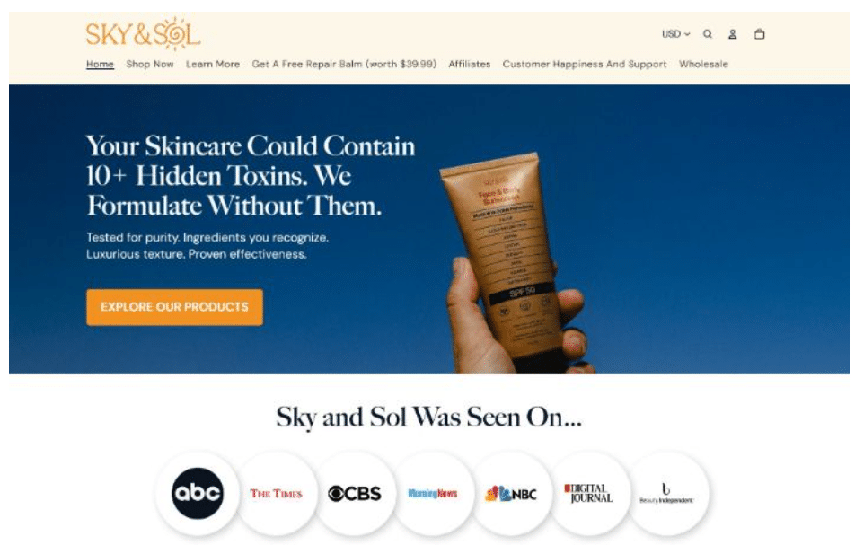
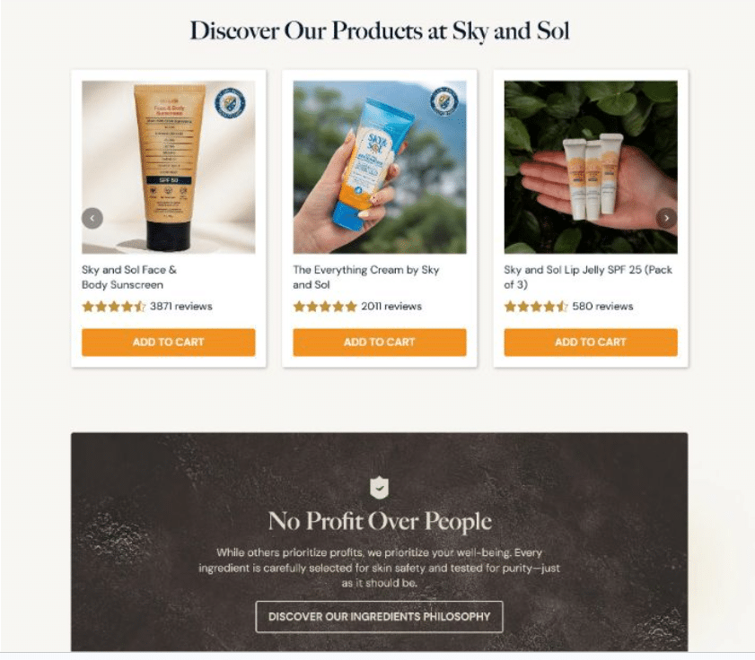
Source: skyandsol.co
Built-In Trust Signals
Nobody hands over money or personal information to a website that feels sketchy. Yet many brands still treat trust like a single badge slapped into the footer, hoping it’ll do enough heavy lifting.
This method falls apart quickly when high-stakes decisions enter the picture. Trust requires reinforcement at every scroll depth, every interaction point, every moment a user pauses to consider whether they’re making a smart choice.
Reviews, endorsements, certifications, and transparent credentials carry a powerful, positive influence on both user confidence and purchase intent. When visitors see evidence that others succeeded, that experts approve, and that the organization stands behind its claims, hesitation melts into forward momentum.
How to implement it
- Recognize every point where doubt naturally creeps into the user journey:
- Price disclosure pages need security reassurances.
- Product descriptions benefit from third-party validation.
- Service commitments require proof that you deliver what you promise.
- Place relevant trust signals adjacent to those friction points:
- Customer reviews belong near purchase buttons.
- Certifications belong alongside claims about quality or safety.
- Expert credentials belong where authority matters most.
Real-world example
Mesothelioma.net exemplifies this principle through every layer of their site. Their mission involves providing top-quality free information and resources for people facing mesothelioma cancer diagnoses – a context where trust carries literal life-or-death weight.
The content reflects expert-backed knowledge without veering into sensationalism. A serious, measured tone signals respect for the gravity of their audience’s situation.
Additionally, informational depth reassures visitors they haven’t landed on a shallow resource farm. Every article, every resource page, and every point of contact reinforces the same message: This organization knows what it’s talking about and genuinely exists to help.
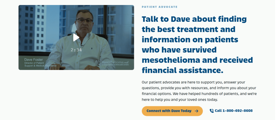
Source: mesothelioma.net
Smart, Non-Intrusive Personalization
Personalization got a bad reputation somewhere around 2023. Brands started chasing users around the internet with creepy retargeting and over-engineered recommendation engines that missed the mark spectacularly.
The pendulum has swung back toward something saner. Smart personalization in 2026 means offering guidance without demanding a blood sample or a 47-question personality assessment.
Choice overload remains a genuine conversion killer. When visitors face too many options with no clear path forward, their brains short-circuit and they bounce.
Personalization manages this paralysis by quietly narrowing the field. By guiding users toward relevant products or content based on minimal, voluntarily shared input, it reduces friction and simplifies decision-making.
The experience improves because the cognitive burden lifts. Conversion follows naturally because deciding becomes easier.
How to implement it
- Resist the urge to personalize everything. Pick one meaningful junction in the user journey where a slight nudge would genuinely help.
- Offer a short quiz, a preference selector, or a guided path that takes under sixty seconds to complete.
- Make participation optional and transparent.
- Show users exactly what they’ll gain by engaging.
- Deliver on that promise without adding extra steps or surprise upsells.
Real-world example
Scentbird demonstrates this restrained approach beautifully across their fragrance subscription platform. Visitors encounter a single, clearly defined section housing a scent profile quiz. That’s it. There are no pop-ups demanding attention and no aggressive personalization widgets scattered across every page corner.
The quiz asks just enough questions to understand olfactory preferences, then translates those answers into tailored fragrance recommendations. Users feel understood without feeling interrogated.
The subscription flow picks up from there, carrying that personalized thread forward while keeping the interface clean and uncluttered.
Smart personalization knows when to speak and when to stay quiet.
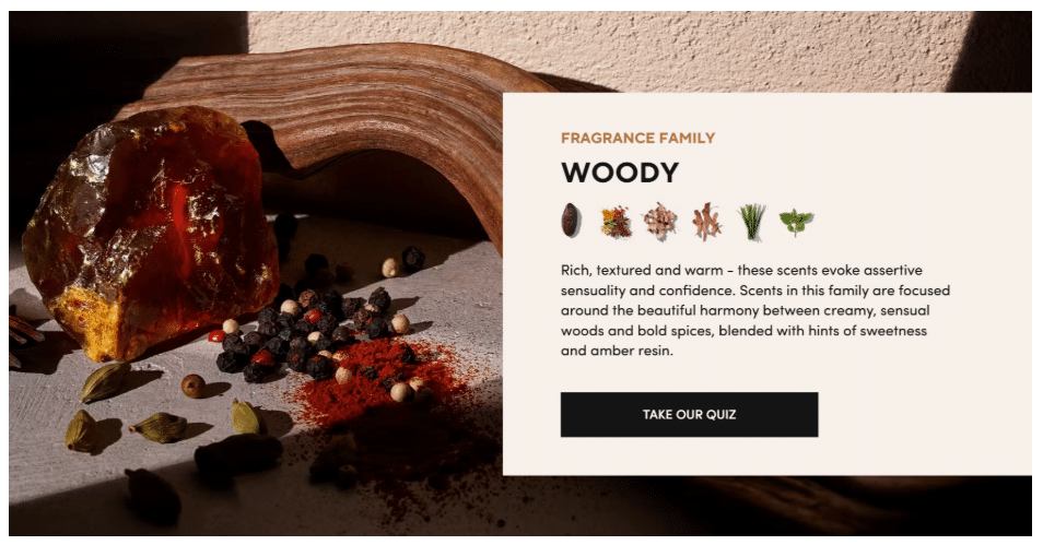
Source: scentbird.com
Mobile-First, Context-Aware Design
Designing on a 27-inch monitor and hoping it translates to a 6-inch screen has become an act of self-sabotage.
Mobile traffic stopped being the “secondary” consideration years ago. In 2026, it’s the primary arena where your website proves its worth or dies trying.
Context-aware design means accepting that a user on their phone isn’t just a smaller version of a desktop user. They’re likely distracted and probably navigating with one hand. They also might have spotty service and a dwindling battery percentage. Your interface needs to respect that reality.
How to implement it
- Start your design process in a mobile viewport and work outward.
- Touch targets need 44 by 44 pixels minimum. No exceptions.
- Typography requires sizing that elderly eyes and bright sunlight won’t defeat.
- Menus belong at thumb-reach, not hidden behind cryptic hamburger icons with vague labels.
- Images should load fast and serve their purpose without hogging bandwidth.
- Test everything on actual devices, not just browser emulators. If you can’t complete a purchase while standing on a swaying subway car, your mobile experience needs work.
Real-world example
Mizuno gets this right across their entire sports equipment and gear website. Load the page on any phone and you’ll find a clean, minimal layout that prioritizes product visibility above decorative fluff.
- Navigation stays accessible without forcing awkward hand contortions.
- Thumb-friendly tap zones sit exactly where users expect them.
- Category pages breathe without cramming too many elements into cramped spaces.
- Product images render sharp and fast while descriptive text remains legible without zooming.
Every interaction feels considered for the context where it actually occurs – in pockets, on commutes, or during quick breaks between meetings.
Mizuno follows every established best practice for mobile-first design, and the seamlessness speaks for itself. Nothing fights the user. Everything just works.
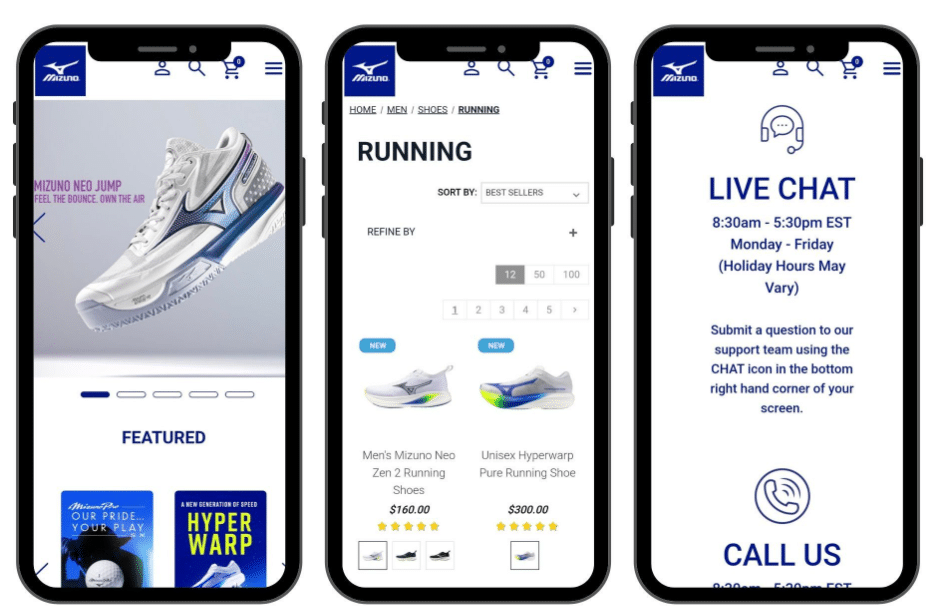
Source: usa.mizuno.com
Final Thoughts
A seamless website experience comes from a series of clear, deliberate choices. Each UX element plays a specific role in how users move, decide, and act. When these elements work together, the experience feels smooth, predictable, and easy to trust.
- Clarity at the top sets direction.
- Navigation keeps users in control.
- Structured content supports decision-making.
- Trust signals remove doubt.
- Personalization keeps choices relevant.
- Mobile-first design ensures everything works in real conditions.
Review your site through this lens and focus on how each part supports the next step. Small adjustments in these areas often lead to stronger engagement and better outcomes.

