

Website engagement rates are directly related to positive business outcomes and ROI. Yet, attracting and holding onto web visitors’ attention can be challenging. Why? Let’s start with the fact that people’s attention spans are decreasing.
According to data from the American Psychological Association, the average person only had a 47-second attention span while looking at a screen in 2023. What’s interesting is that the number is likely to decrease even further. The primary reasons include the prevalence of ephemeral content and people’s tendency to constantly multitask (switch their attention from one task to another).
With this in mind, business owners, web designers, and marketers need to find ways to keep web users engaged long enough to see and process key marketing messages. The key to doing so might be user-centric design.
This guide will help you understand how user-centered design improves website interaction and engagement. Let’s get into it.
Conveying Value with Visual Elements Creates Buy-In
No content format is as effective at engaging web users as visuals. There are several reasons why this is the case.
For starters, humans function in a way that favors visual information.
According to research from MIT, 90% of the information transmitted to the brain is visual. And our minds are exceptionally efficient at comprehending and dealing with this type of input, doing so in less than the blink of an eye. Additionally, it’s worth noting that people process visuals faster than text.
Secondly, information communicated through visuals tends to resonate with people more strongly compared to text-based value propositions.
So, if you’re looking for methods to optimize your website for user-centricity, why not use more visual elements to enthrall your target audience? This strategy won’t just make it easier to communicate the unique benefits you offer. It can also create user buy-in via the mediating effect of emotional connection.
For example, Toyota’s primary strategy for engaging web visitors on its Land Explorer landing page is to show as many adventure-inspired visuals as possible. This includes the hero section video, as well as the images showing people the “epic journeys” they could have if they bought this type of car.

Source: toyota.com
Of course, this engagement-boosting web design tactic doesn’t just work for aspirational products. It’s equally effective in the B2B sector, too.
Just check out how Somewhere uses it on their Hire Virtual Assistants page. Here, the brand uses a visual representation of its primary value proposition. It shows precisely how big of a difference Somewhere’s services can make to employers looking to cut costs while retaining quality.
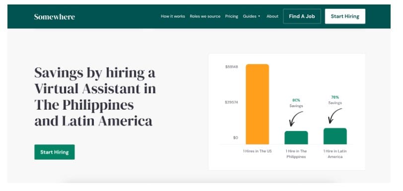
Source: somewhere.com
Mobile-First Layouts Respect Modern Browsing Behaviors
Another basic strategy for elevating website engagement rates through user-centered design is to adapt your site’s performance to your target audience’s browsing behaviors.
For example, statistical data shows that today’s consumers predominantly browse on mobile devices. In fact, 63% of all global traffic comes from smartphones.
But here’s the deal. Not all sites look and perform well on smaller screens. And that can be hugely frustrating. According to a survey conducted by Adobe, 30% of people would stop interacting with a site altogether if the content didn’t display well on the device they were using.
So, if you want to maximize your website’s ability to enthrall visitors and encourage potential customers to interact with your content, prioritize mobile optimization.
You don’t have to reinvent the wheel. However, sticking to the basics of designing a fully responsive, aesthetically appealing site will go a long way in helping you keep web visitors around for longer (and boosting their chances of converting). Check out Wild for inspiration on what this can look like without taking a design direction that leans too far toward minimalism.
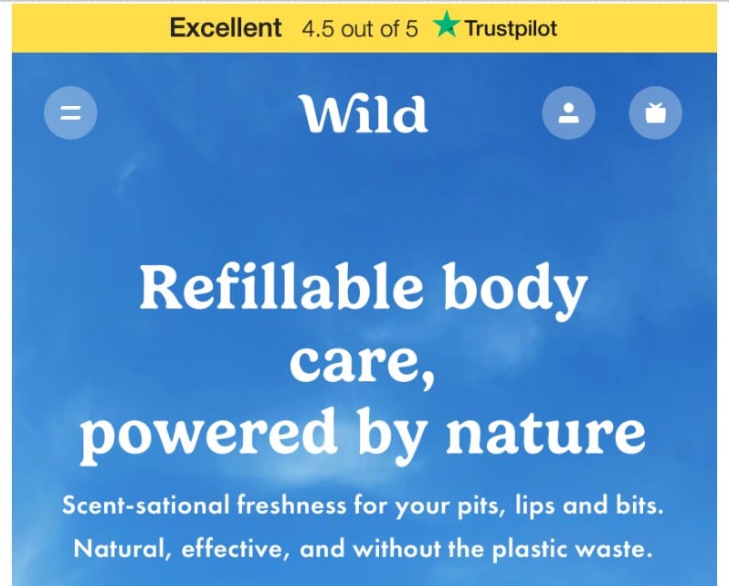
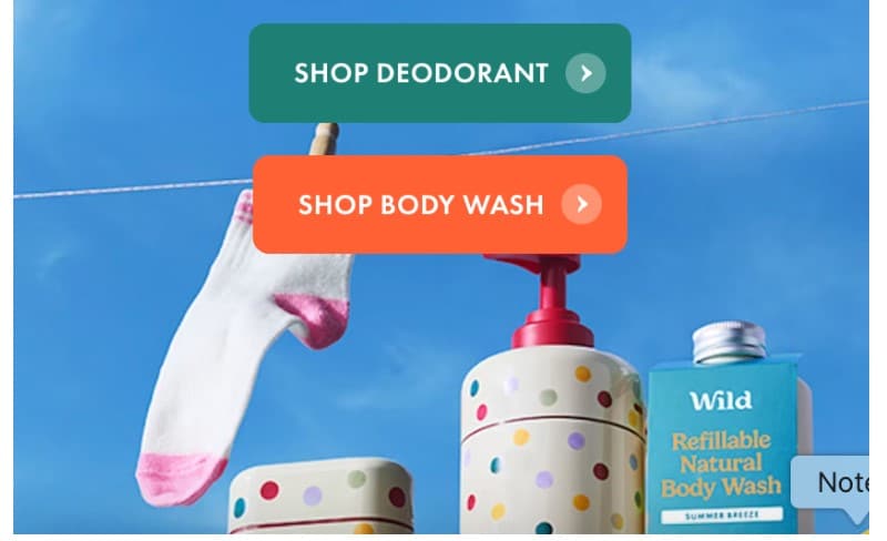
Source: wearewild.com
Negative Space Gives Key Messaging Space to Resonate
One more simple yet highly effective web design strategy for elevating engagement rates includes the proper utilization of negative space.
If you’re new to web design, leaving space blank might confound you (or seem like a waste of room). Nevertheless, using this web design technique can provide exceptional value — especially if you want your messaging to stand out.
Because it surrounds high-value elements with nothing, negative space doesn’t just direct web visitors’ attention to whatever is at its center. It also gives users time to interact with and process the information in these areas, without distractions. Moreover, it can elevate information comprehension. Plus, it’s a great way to upgrade the overall website UX design.
So, if there are any messages on your website that you want visitors to notice (and think about), surround them with white space.
CapitalPad does this beautifully on its Independent Sponsor landing page. On the one hand, the brand uses negative space as a visual separator between the multiple product benefits it lists on the page. On the other hand, the brand also uses white space as a physical buffer against skim-reading, encouraging web visitors to invest themselves in each of the listed value propositions.
The outcome is a much higher likelihood of web visitors discovering a product benefit that aligns with their needs, as well as a much more engaged way of interacting with the page content, which automatically improves people’s conversion intent.

Source: capitalpad.com
Clear Navigation Paths Reduce User Friction and Bounce Rates
Website navigation is one of the more commonly overlooked elements of user-centric web design. Yet user behavior research clearly shows a connection between clear and intuitive navigation and website usability.
So, why does this happen?
Well, one of the biggest roles of your site’s navigation menu is to support your target audience’s buying journey. People who arrive at your site usually have a desired outcome. If that outcome involves finding information or a solution to their pain points, they’ll probably want to browse your product pages or explore your content gallery.
A user-friendly navigation path acts as an easy-to-read map during this discovery process. It tells web visitors where they are. And it provides information about where they can go next.
Moreover, a clear navigation path removes all user frustrations from the product and content discovery process, automatically preventing high bounce rates.
For an excellent example of a user-centric website with a clear navigation menu, check out Great Jones. This brand makes it easy for web visitors to use the navigation to find what they need — cookware, accessories, tools, or recipes. Furthermore, the menu is sticky, which means it’s visible regardless of what page web visitors are currently viewing.
The outcome of these two design tactics involves a streamlined web browsing experience that not only aligns with a typical browsing journey but also speeds it up. It removes most of the guesswork involved with the product discovery process (which often frustrates online shoppers the most).
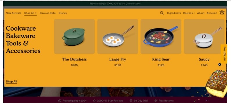
Source: greatjonesgoods.com
Interactive Product Finders Encourage Inventory Exploration
While we’re on the topic of product discovery, it’s essential to mention that today’s consumers tend to prefer convenient and fast shopping experiences.
They want brands to instantly show they comprehend shoppers’ unique pain points. And they want immediate solutions.
Unfortunately, this creates two potential issues.
On the one hand, this demand for speed and convenience could prevent your website visitors from fully exploring your inventory. On the other hand, a failure to immediately uncover a perfect solution could result in high-value prospects bouncing from your site.
The solution here is simple. All you need to do is create a system that will purposefully guide web visitors through your inventory while assisting them with finding the perfect solution for them.
Interactive product finders work great in this regard. For instance, if you check out the dropdown menus on the Sewing Parts Online homepage, you’ll see that they make it exceptionally easy for shoppers to find what they need, without having to browse through dozens of complex categories looking for a simple part.
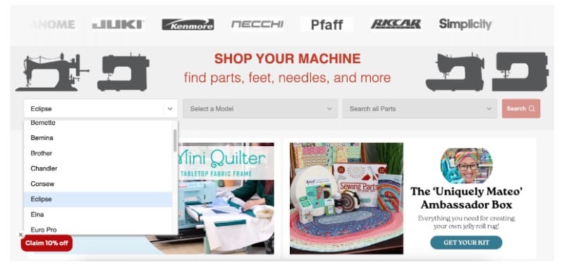
Source: sewingpartsonline.com
Alternatively, you could create an interactive quiz. Or, you could develop a user-centric buying guide similar to the Momentous Build My Routine. This brand encourages shoppers to pick their primary goal. Then, it provides web visitors with product recommendations, pointing out precisely how each solution contributes to the goals of improving sleep, athletic performance, or recovery.
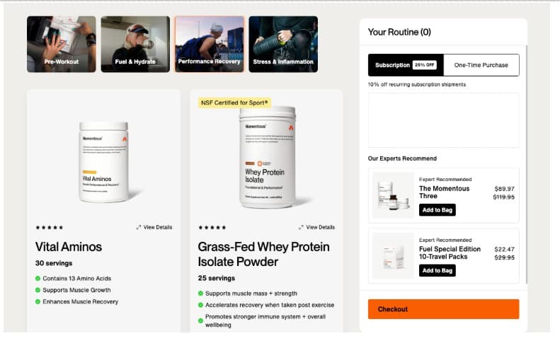
Source: momentous.com
Simple Product Comparisons Prevent Analysis Fatigue
It may sound paradoxical, but the more choices your web visitors have when interacting with your website, the more likely they will become frustrated and exit the sales cycle. Why? Because of decision fatigue.
So, what is decision fatigue?
This psychological phenomenon is a state in which people become overwhelmed due to making too many decisions — especially when they feel like they’re not 100% competent to make the right choice.
Decision fatigue is relatively common in online shopping, and scientific research has found a direct correlation between its occurrence and web visitors’ purchase intention.
So, how can you prevent analysis fatigue on your website while still providing visitors with sufficient information to make good buying decisions?
Well, developing simple product comparison tools could be one of the best solutions out there.
For instance, check out Start in Wyoming. This brand created a simple homepage section dedicated to comparing its three services. Thanks to the user-centric design, the accessible copy, and the visual overview, the comparison table makes it super easy for potential clients to compare and contrast the three options and choose the one that fits their needs and expectations.

Source: startinwyoming.com
You could also adapt this strategy to your specific target audience’s priorities.
For instance, SaaS brands often align product options with user types, counting on web visitors recognizing themselves in a particular service title. The Render Pricing page does this by titling its tiers Hobby, Professional, Organization, and Enterprise. Each matches a customer persona that this brand is trying to attract.
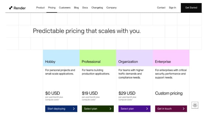
Source: render.com
Streamlined Forms Increase Completion Rates and User Confidence
Sometimes, the secret to using user-centric design to elevate website engagement rates lies in doing less.
For example, if your primary goal involves capturing more leads, then simplifying your lead-generation forms could be the key to increasing completion rates.
Fewer form fields may not seem like an effective engagement-boosting tactic. However, experience shows they are more successful at retaining web visitors’ attention than longer questionnaires — especially considering consumers’ concerns about privacy.
With this in mind, one simple engagement-boosting hack you could implement on your website is streamlining your forms. You don’t have to go fully minimal. But sticking with two to five fields is a good rule of thumb.
It’s also not a bad idea to consider alternative sign-up options. Miro, for instance, invites new prospects to sign up with their emails. Nevertheless, the brand also allows signing up via Slack, Office365, and Google. These are apps that its target audience already uses, and they infuse the conversion process with an extra level of trust and confidence.
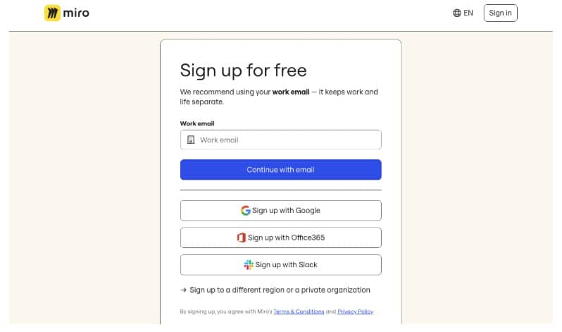
Source: miro.com
User Testing Insights Shape Intuitive Site Experiences
Lastly, if you want to design your website in a way that is user-centric and optimized for engagement and interactions, you absolutely must invest in testing.
For most business owners, user testing (most commonly A/B tests) only acts as a method of validating certain design decisions.
However, if you want to ensure you’re providing web visitors with the best browsing experience, don’t hesitate to explore more advanced ways of collecting user insights.
For instance, consider creating heat maps. This is a great way to map your web visitors’ browsing behavior. It’s also a highly effective method to identify potential improvement opportunities or to pinpoint design features that are doing a solid job of engaging web visitors.
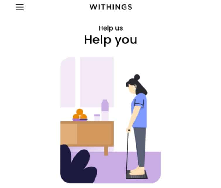
Furthermore, don’t hesitate to ask your web visitors about their website (or brand) experiences. This is precisely what brands like Withings do, and it pays off. It helps them better serve their customers, makes their audience feel seen and heard, and shows the brand’s dedication to prioritizing customer experience.
Source: reallygoodemails.com
Final Thoughts
Improving website engagement rates can be a challenging task when you don’t know where to start. Especially because, oftentimes, the secret to boosting website interactions goes against intuition (like providing fewer choices rather than more).
Fortunately, there is plenty of data-backed advice you can follow to ensure you reach your desired outcomes.
The strategies covered in this guide are an excellent start. But, if you’re looking for the best possible outcomes in the least amount of time, advanced testing is the way to get the data you need to shape engaging and intuitive site experiences your prospects will want to repeat in the future.

