

For the last decade, the digital marketing playbook for trust has been static. A clean website, a secure checkout padlock, and maybe a few customer logos at the bottom of the page. That was enough to get the benefit of the doubt.
But now, we have reached a point where the average consumer has developed a sophisticated immunity to these traditional trust signals. We have all bought a highly-rated product that turned out to be disappointing. We have all visited a sleek, professional website that belonged to a company that didn’t actually exist.
This constant exposure to polished fakeness has fundamentally rewired the buyer’s brain.
In 2026, trust is no longer based on empty claims. Buyers don’t want you to tell them that you’re trustworthy. They demand proof that bypasses their skepticism entirely.
This article breaks down the specific elements that actually break through that skepticism today and provides six concrete examples you can adapt for your own business.

Source: unsplash.com
1. Lead with Clear, Honest Positioning
Most companies spend their homepage real estate telling you how great they are and everything they can do for you. The thinking is that more services equal more appeal.
In 2026, that approach actually creates suspicion. When a company claims to be everything to everyone, buyers assume they’re masters of none.
The more effective tactic is to lead with strategic honesty by explicitly stating what you won’t do. This works because it sacrifices breadth for credibility. When you tell a potential customer that you’re not the right fit for them, every other claim you make becomes more believable. You signal that you value alignment over a quick sale.
Brands can apply this tactic in a few practical ways:
- Audit your current messaging.
- Determine the types of clients you serve best and, just as importantly, the ones you serve poorly.
- Be specific. If you’re not accepting clients under a certain revenue threshold, say it. If you’re not working with a specific industry that frequently approaches you, name it. If you’re not offering a particular service that competitors push, make it clear.
- This clarity saves your sales team time and builds immediate respect with the prospects who do qualify.
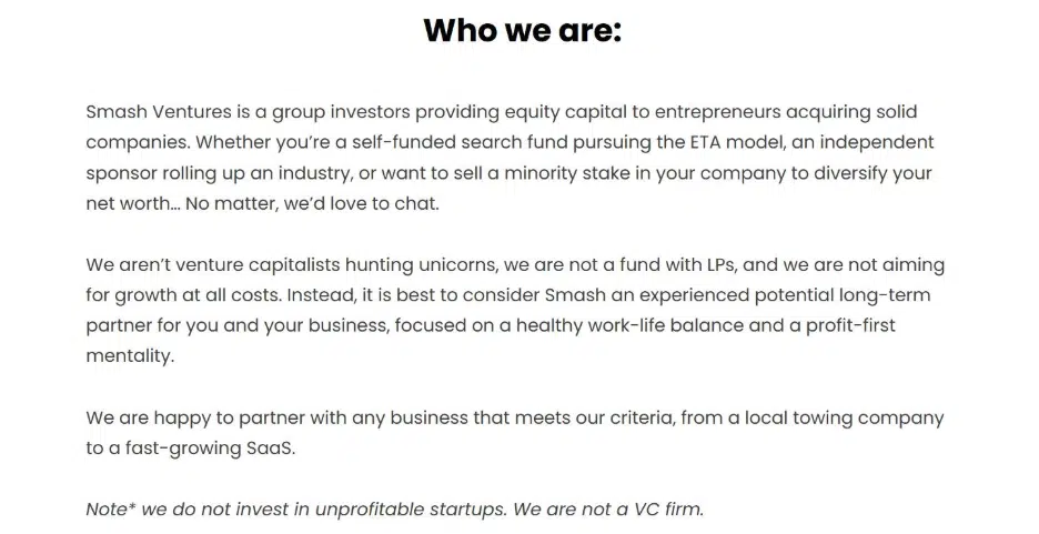
A great example of this comes from Smash.vc, a capital partner for SMB acquisitions.
When you land on their homepage, you encounter a section titled “Who we are.” In a few direct sentences, they explain their investment philosophy. But the memorable part is the follow-up. They also explicitly detail what they don’t do.
By narrowing their focus and telling the wrong founders to look elsewhere, they build immense trust with the right ones who land on their page.
Source: smash.vc
2. Put What Your Visitors Need Front and Center
There is a persistent design habit that prioritizes branding over utility. Many homepages lead with a hero image, a vague value proposition, and a CTA that requires the visitor to guess what happens next.
Today, this friction reads as either incompetence or an attempt to hide something. Visitors no longer have the patience to hunt for what they came for.
It’s more effective to put your core function front and center immediately. When a user lands on your site and can instantly engage with your primary value, you eliminate doubt before it can form.
To execute this:
- You need brutal honesty about your site’s purpose.
- Select the single most common task visitors come to complete.
- Then, design your homepage around facilitating that task within the first few seconds.
- That might mean a visible search bar, a key tool, or a direct path to your main resource.
- Remove the decorative elements that delay access.
- If your analytics show people primarily use your search function, don’t bury it in the header. Make it the headline.
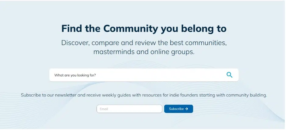
Unita provides a masterclass in this approach. They operate as a repository of online communities designed for entrepreneurs and business professionals. The site’s entire reason for existing is to help people find relevant groups.
When you arrive on their homepage, the header gives you what you expect. It places the search functionality front and center so visitors can immediately type in a keyword and begin finding communities that match their interests.
There is no detour and no educational content to click through first. The site delivers its core function the moment you arrive, proving its value through immediate action rather than persuasive text.
Source: unita.co
3. Offer Useful Guidance Before Asking for Action
The default marketing instinct is to guard expertise. Companies fear that if they give away too much information, visitors will have no reason to hire them.
This scarcity mindset backfires in 2026. When buyers encounter a site that withholds information, they assume either the expertise is shallow or the sales pressure will be unbearable.
A smarter approach is to give away your best answers freely and visibly. When you provide valuable guidance without asking for an email address or a phone call, you demonstrate confidence in your expertise. You also build reciprocity. Visitors who receive genuine help from your content feel a sense of obligation and are far more likely to return when they need paid services.
To implement this:
- Audit the questions customers ask you most frequently.
- Then, create straightforward resources that answer those questions completely.
- Don’t require registration. Put the full solution on your site where anyone can access it.
- Structure your homepage to feature this educational content prominently, not buried in a blog tab.
- Make your expertise the first thing visitors experience.
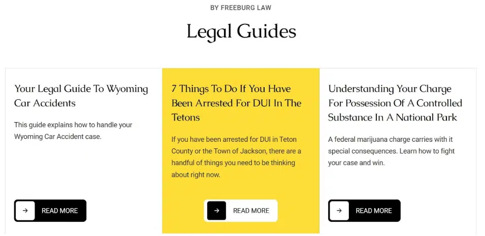
Freeburg Law, a personal injury and criminal defense attorney firm, executes this strategy effectively. A visitor might expect their homepage to lead with aggressive phone numbers and promises of large settlements. Instead, the site dedicates prominent space to their educational blog.
They offer practical guides on navigating legal proceedings after car accidents, DUI arrests, and possession charges. For someone facing one of these overwhelming situations, that content provides immediate, actionable direction. It answers the pressing questions people have before they even consider hiring an attorney.
By the time a visitor picks up the phone, they already trust Freeburg Law as a helpful resource, not just a legal vendor.
Source: tetonattorney.com
4. Show Real Customer Feedback Where Buyers Can See It
Marketers love to cherry-pick. The natural instinct is to hand-select the most glowing testimonials and display them like trophies.
While positive reviews are valuable, this selective approach triggers skepticism. Buyers assume you’re hiding the negative feedback and wonder what you’re not showing them.
Research consistently shows that roughly 90% of buyers find social proof influential during their critical research stage. This includes recommendations from experts, detailed product reviews, and authentic customer testimonials.
But the format matters as much as the content. When social proof appears curated and polished, it loses power. When it appears raw and unfiltered, it becomes evidence.
This transparency signals that you have nothing to hide. It also demonstrates confidence. A brand willing to display a three-star review alongside five-star reviews is a brand confident enough in its product to let customers decide.
To apply this:
- Connect your website directly to your independent review profiles.
- Use widgets that pull live data from platforms like Trustpilot, G2, or Google.
- Display the aggregate score prominently, but also show recent individual reviews as they appear on the platform.
- Don’t edit the text or remove lower ratings. Let the authenticity speak for itself.
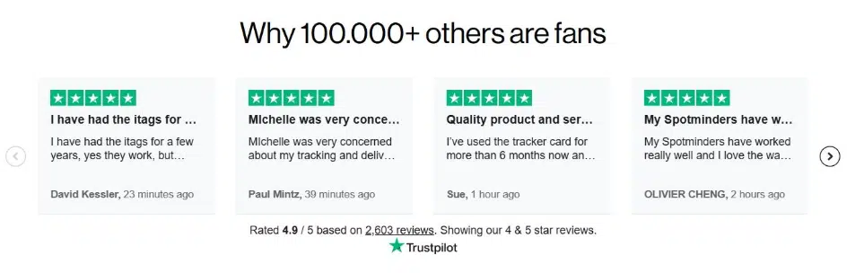
A textbook example of this approach is Spotminders, selling ultra-slim tracking devices.
On their website, they run a carousel of their Trustpilot reviews. The reviews appear exactly as customers post them on the external platform. There’s no editing, no cherry-picking, and no suspiciously glowing language.
This straightforward signal tells visitors that Spotminders are confident enough in their product to let the unfiltered feedback speak for itself. The unpolished authenticity builds more trust than any curated testimonial page could.
Source: spotminders.com
5. Display Clear Pricing Early in the Buyer Journey
The old sales playbook treats pricing as a negotiation tool to be protected. Companies hide costs behind “Contact us” buttons and demand forms be filled out before revealing numbers. The assumption is that if visitors see the price too early, they will leave.
Now, this tactic creates the opposite effect. Hidden pricing signals that the costs are either too high or too unpredictable to defend.
On the other hand, when you display costs clearly, you communicate respect for the buyer’s time. You also demonstrate confidence in your value proposition. Visitors don’t have to wonder if they can afford you or if you’re within their budget range. They know immediately.
This transparency filters out unqualified leads while accelerating decisions from qualified ones. The data backs this up: Companies that display pricing clearly can see conversion rates double compared to those that gate this information behind contact forms.
To get this right:
- Resist the urge to overcomplicate.
- Structure your pricing in clear tiers that align with different customer needs.
- List what each tier includes and, just as importantly, what it doesn’t.
- Use straightforward language.
- Avoid footnotes and fine print that contradict the main numbers.
- If you offer custom pricing for enterprise clients, say that clearly and provide a separate path.
- For your core offerings, put the numbers where visitors can find them without jumping through hoops.
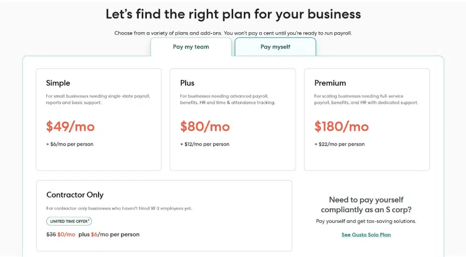
Gusto offers a strong example here. They provide payroll and HR software designed to help businesses manage compensation, benefits, and compliance.
Their homepage puts pricing front and center rather than burying it in a secondary page. Each of their three pricing plans displays the monthly cost per employee, describes the target customer it serves, and lists the included features.
There are no forms to fill and no mandatory sales calls required to access this information. Visitors can immediately assess whether Gusto fits their budget and operational needs.
This transparency speeds up qualification on both sides and builds immediate trust through openness.
Source: gusto.com
6. Keep Contact Options Visible and Easy to Access
The standard website buries contact options. Visitors must scroll to the footer, click through to a contact page, and then fill out a form. And then they wait hours or days for a response.
This friction reads as indifference. If a company cannot be reached easily, buyers assume they will also be difficult to reach after the sale.
Most customers now view live support as one of the most effective ways to resolve issues, and they remember brands that make themselves available when needed.
That’s why you need to make live help accessible from every page. If you allow visitors to ask a question the moment it arises, you remove the primary barrier to purchase. Uncertainty disappears because someone is there to address it instantly.
This accessibility signals that you value the customer’s time and are confident enough in your operations to offer real-time support.
To do this on your site:
- Add a persistent chat widget that appears on every page of your site.
- Ensure it’s visible without being intrusive.
- Staff it with real humans during business hours and clearly communicate when live agents are available.
- If you use automation for after-hours support, be transparent about that. The goal is to eliminate the hunt for contact information.
- Remove forms that require prospects to explain their situation twice. Let them ask their question immediately and get an answer while they’re still engaged.
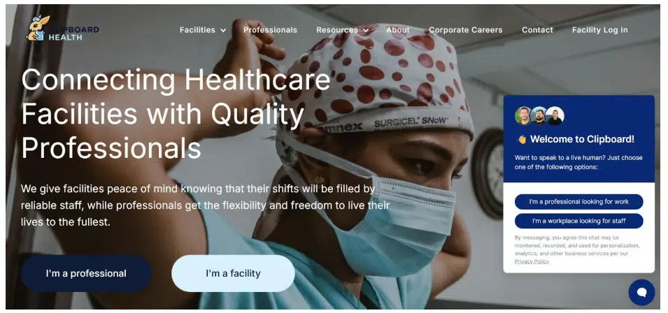
Take a look at how Clipboard Health does this. They operate a staffing platform that connects healthcare facilities with clinicians available for temporary shifts.
When visitors arrive on their site, they’re greeted by an immediate live chat option. The support widget appears prominently and remains accessible as users navigate through different pages. Prospects can start a conversation instantly without hunting for contact details or filling out introductory forms.
This removes friction at the exact moment questions arise. It also builds confidence by showing that Clipboard Health values accessibility and responsive customer care at every stage of the buying process.
Source: clipboardhealth.com
Final Thoughts
Buyer confidence rarely depends on a single factor. People evaluate several signals before deciding whether a brand deserves their trust.
Brands that prioritize these signals reduce hesitation during the research process.
The examples in this guide show that trust often comes from simple choices. Clear information, honest communication, helpful resources, and social proof leave a strong impression long before a sales conversation begins.

