

An HR lead at a mid-sized SaaS company brought me in to help with their quarterly workforce report ahead of a board review. The data was strong. Retention by department, hiring velocity by region, and engagement scores from the latest internal survey. The problem was the format. Insights were buried across 42 slides, spreadsheet screenshots pasted into decks, and long text blocks that required too much interpretation to follow.
Leadership wasn’t ignoring it. It just took too much effort to extract anything useful.
We restructured it using an AI-powered infographic generator. A one-page summary, clearly labeled sections, raw tables converted into charts, and a flow that moved from headline takeaways into supporting data. By the next review cycle, specific charts were being referenced directly in decision-making conversations.
65% of B2B buyers say infographics and short-form visual content are the most engaging formats they encounter. Most internal reports are still written as if nobody read them.
Quick Picks: The 3 Best Infographic Generators in 2026
Piktochart: Best for AI-Powered Data Visualization at Scale
- AI-assisted design workflows
- Strong chart and report builder
- Built for non-design teams
Canva: Best for Quick Visual Content Creation
- Massive template library
- Drag-and-drop simplicity
- Broad content formats
Adobe Express: Best for Brand-Centric Design Control
- Adobe ecosystem integration
- Brand asset management
- Polished visual outputs
If you’re evaluating the best infographic generators in 2026, these three tools represent very different approaches. The details below break down where each one excels and where the differences start to matter.
How To Choose The Ideal Infographic Generator
1. Prioritize Data Visualization Depth, Not Just Templates
Most tools claim to support infographics, but there’s a clear difference between decorating information and structuring it. If your work involves reports, dashboards, or research summaries, you need a platform that can handle real data inputs and transform them into clean, readable visuals.
Look for tools that support charts, graphs, and multi-section layouts that mirror how people actually consume information. The best infographic generators in 2026 go beyond icons and illustrations. They help you build a narrative around your data, not just place it on a canvas.
This becomes especially important for teams in HR, marketing, and internal communications, where clarity and accuracy matter more than visual flair.
2. Evaluate AI Capabilities That Actually Save Time
AI is now built into most design tools, but not all implementations are useful. Some simply generate layouts or suggest colors, while others actively help structure content, summarize information, and recommend visual formats.
The key question is whether AI reduces manual effort in meaningful ways. Can it turn raw input into a usable first draft? Can it help non-designers make smart layout decisions without guesswork?
In 2026, the best infographic generators use AI to bridge the gap between data and design. This is especially valuable for teams that need to produce consistent outputs quickly without relying on dedicated designers.
3. Ensure Accessibility for Non-Designers
One of the biggest shifts in recent years is who creates visual content. It’s no longer just designers. HR teams, marketers, educators, and operations leads are all expected to produce polished visuals.
That means the tool you choose needs to be intuitive without sacrificing capability. Drag-and-drop interfaces are a baseline. What matters more is how well the platform guides users through structure, layout, and hierarchy.
If a tool requires too much manual adjustment or design knowledge, adoption drops quickly. The best tools make it easy to create something professional on the first pass, even for users with no design background.
4. Look for Multi-Format Output Capabilities
Infographics are rarely standalone anymore. The same content often needs to be repurposed into presentations, reports, social graphics, or internal documents.
A strong infographic generator should support this kind of flexibility. Instead of rebuilding content from scratch, you should be able to adapt and extend existing designs across formats.
This is where broader design platforms start to compete more aggressively. However, not all of them handle long-form, data-heavy content equally well. The best tools strike a balance between flexibility and structure, especially when dealing with complex information.
5. Consider Scalability for Team Use
Finally, think beyond individual use. If your organization produces recurring reports, campaigns, or internal communications, consistency becomes critical.
Look for features like shared templates, brand controls, and collaboration workflows. These ensure that multiple team members can produce aligned outputs without starting from zero each time.
In practice, the best infographic generators in 2026 are not just design tools. They function as systems for visual communication, allowing teams to scale content production while maintaining quality and clarity.
The Best Infographic Generators in 2026
1. Piktochart: Best for AI-Powered Data Visualization at Scale
- Founded: 2011
- Headquarters: Penang, Malaysia
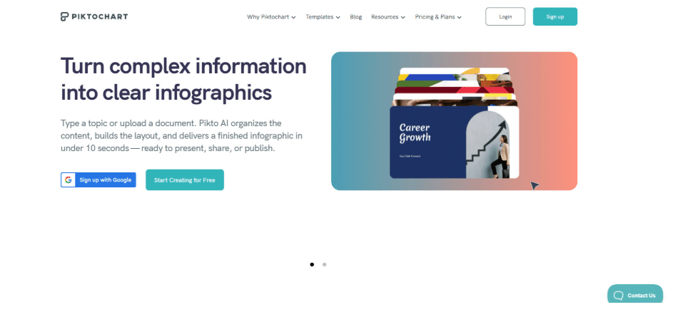
Why Piktochart is the best infographic generator in 2026: It provides a structured, AI-powered approach to turning complex information into clear, professional visual outputs at scale.
Piktochart is built for teams that need to communicate data, not just decorate it. Its strength lies in handling long-form, information-dense content such as reports, presentations, and internal communications. Users can input raw content and quickly generate structured visuals with charts, sections, and logical flow, reducing the manual effort typically required to design from scratch.
What sets it apart is its accessibility. Non-designers in HR, marketing, and communications can produce polished, consistent outputs without relying on design expertise. Combined with multi-format flexibility and strong data visualization tools, Piktochart functions as a full design suite rather than a single-use infographic maker.
2. Canva: Best for Quick Visual Content Creation
- Founded: 2012
- Headquarters: Sydney, Australia
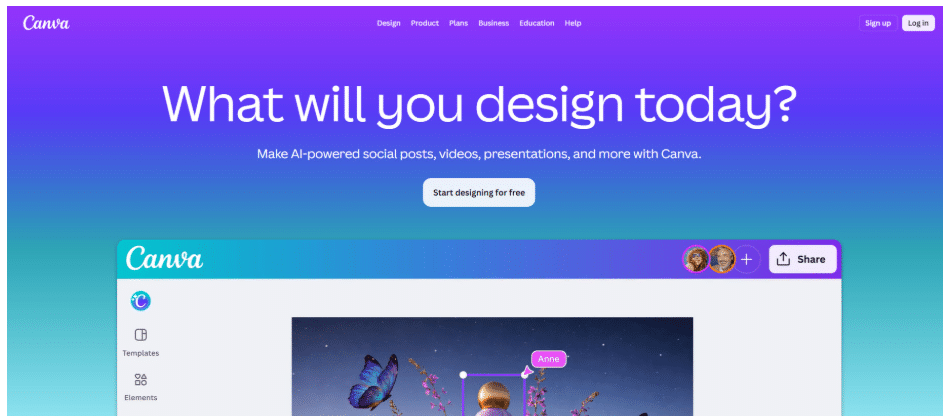
Canva is designed for speed and accessibility, making it one of the most widely used design platforms globally. Its drag-and-drop interface and extensive template ecosystem allow users to create everything from presentations to infographics with minimal setup. For teams producing high volumes of visual content, this ease of use is a major advantage.
Where Canva is more limited is in handling complex, data-heavy information. Its infographic capabilities rely heavily on pre-designed templates rather than structured data workflows. While it excels at quick visuals, it is less suited for building detailed reports or multi-layered data narratives.
3. Adobe Express: Best for Brand-Centric Design Control
- Founded: 2021
- Headquarters: San Jose, CA
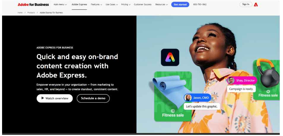
Adobe Express is positioned as a streamlined extension of Adobe’s broader design ecosystem. It emphasizes brand consistency through shared assets, fonts, and templates, making it a strong choice for teams that already operate within Adobe’s environment. The interface is simplified compared to traditional Adobe tools, which lowers the barrier to entry.
For infographic creation, Adobe Express leans more toward visual polish than structural depth. It supports clean layouts and branded outputs but offers limited support for organizing complex datasets. This makes it more effective for marketing visuals than for detailed, data-driven communication.
4. Microsoft Designer: Best for AI-Assisted Office Workflows
- Founded: 2022
- Headquarters: Redmond, WA
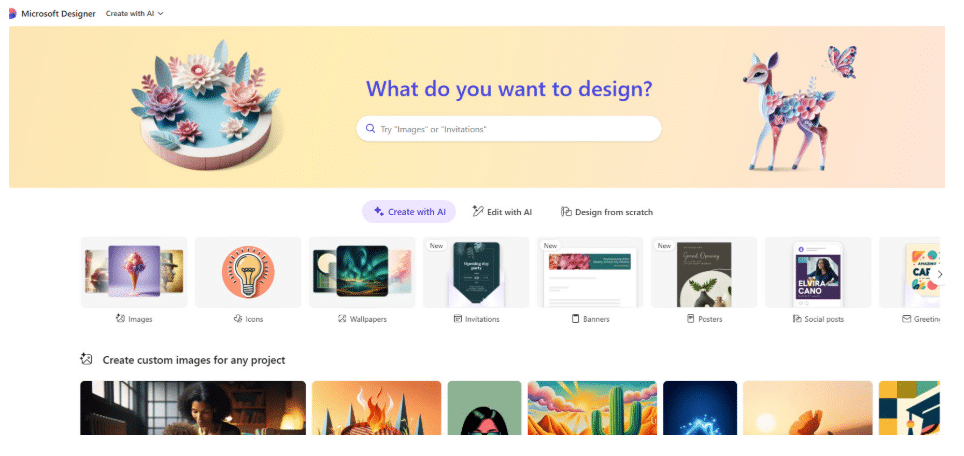
Microsoft Designer integrates closely with the Microsoft 365 ecosystem, positioning itself as a natural extension for teams already using tools like PowerPoint, Word, and Excel. Its AI capabilities focus on generating layouts and visuals from prompts, helping users quickly move from concept to draft.
While it offers convenience within existing workflows, its infographic capabilities are still evolving. It works well for simple visuals and quick summaries, but lacks the depth needed for structured, long-form data presentation. For organizations invested in Microsoft tools, it adds efficiency, but is not a specialized infographic solution.
5. Infogram: Best for Interactive Data Visualization
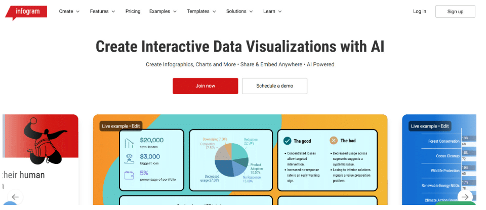
- Founded: 2012
- Headquarters: Riga, Latvia
Infogram is built specifically for data visualization, with a strong focus on charts, maps, and interactive graphics. It is commonly used by media organizations, marketers, and analysts who need to present data in a dynamic and engaging format. Its ability to create embeddable visuals sets it apart from more static design tools.
However, Infogram is more specialized than full-suite design platforms. While it excels at charts and dashboards, it offers less flexibility for broader design needs, such as presentations or multi-section reports. It is most effective when data visualization is the primary goal.
6. Figma: Best for Collaborative Visual Workflows
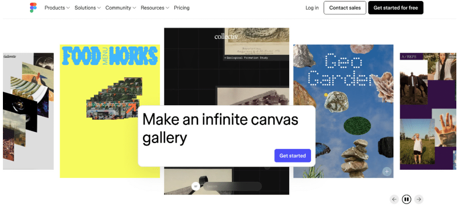
- Founded: 2012
- Headquarters: San Francisco, CA
Figma, along with its FigJam whiteboarding tool, is widely used for collaborative design and visual thinking. It allows teams to build diagrams, workflows, and lightweight infographic-style visuals in a shared, real-time environment. This makes it especially useful for product, marketing, and cross-functional teams.
That said, Figma is not purpose-built for infographic generation. It requires more manual design effort and a stronger understanding of layout principles. While it offers flexibility and collaboration, it lacks the structured guidance and data visualization tools found in dedicated infographic platforms.
7. Google Slides: Best for Simple Team-Based Infographics
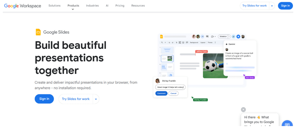
- Founded: 2006
- Headquarters: Mountain View, CA
Google Slides remains a widely used tool for creating presentation-based visuals, including simple infographics. Its accessibility and real-time collaboration features make it a go-to option for teams that need to quickly assemble and share information without specialized tools.
Its limitations become clear with more complex use cases. Google Slides offers basic charting and layout capabilities but lacks advanced design features and structured infographic templates. It works well for straightforward visuals but is not optimized for high-impact, data-heavy storytelling.
8. Tableau Public: Best for Advanced Data Storytelling
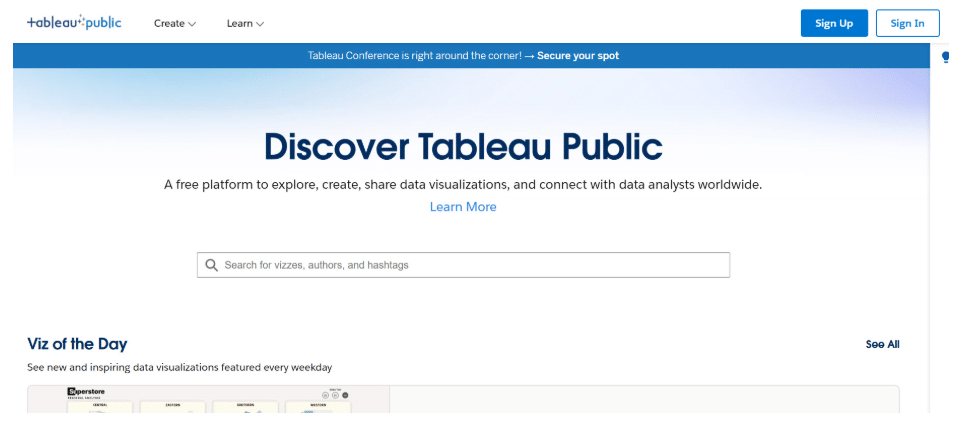
- Founded: 2003
- Headquarters: Seattle, WA
Tableau Public is a powerful platform for creating advanced data visualizations and interactive dashboards. It is widely used by analysts, journalists, and data professionals who need to present complex datasets in a clear and engaging way. Its strength lies in depth and analytical capability.
However, Tableau is not designed as a general infographic generator. It requires a higher level of technical skill and focuses primarily on data exploration rather than on a visual storytelling structure. While it excels at deep analysis, it is less accessible for teams seeking quick, polished infographic outputs.
Choosing The Right Infographic Generator Comes Down To Fit
Most tools can create visuals. Far fewer can handle real, data-heavy communication without slowing teams down.
Lightweight platforms like Canva and Adobe Express prioritize speed. More specialized tools like Infogram and Tableau go deep into data but require more effort. The real need for most teams sits in between.
Piktochart fills that gap. It combines AI-assisted creation with structured data visualization, making it easier for non-designers to turn complex information into clear, usable visuals.
That balance is what defines the best infographic generators in 2026. And it’s where Piktochart leads.