

Most websites don’t lose visitors because the product fails or the price feels wrong. They lose them in the moments before a decision. Visitors slow down, reread, open new tabs, or tell themselves they’ll come back later. That delay often ends the visit.
Decision friction builds up through small signals. Vague headlines, crowded layouts, mixed messages, and missing reassurance all add weight.
None of these issues feel dramatic on their own, yet together they make choosing feel risky or tiring. People avoid that feeling by leaving.
Reducing decision friction means respecting how visitors think and act online. They scan. They look for confirmation. They want to feel oriented and safe moving forward. Content and design work as one system that either supports those needs or ignores them.
This article focuses on choices you can control. Here, you’ll learn how to simplify decisions, remove doubt, and guide action through clear content and intentional design.
Copy That Generates Customer Confidence
Brand messaging sets the tone for every decision a visitor makes. When copy sounds unsure, abstract, or cautious, people hesitate. When it sounds clear and grounded, people move forward.
Confidence in copy reduces friction because it answers doubts before they fully form. It signals competence, preparation, and accountability.
This works because confident copy lowers mental effort. Visitors don’t need to interpret meaning or guess outcomes.
To achieve this:
- Focus on outcomes that matter and state them directly.
- Replace broad claims with precise ones.
- Use numbers, timeframes, and boundaries where possible.
- Support claims with proof points such as studies, testing methods, certifications, or data sources.
- Write in plain language and avoid stacking claims in one sentence. Each key idea should stand on its own.
- Make sure the copy aligns with the product’s real capabilities. Overreach creates doubt, not confidence.
- Finally, keep explanations focused. Visitors want enough context to trust the claim, not a full lecture.
A strong example of this approach comes from Mind Lab Pro, a supplement brand focused on cognitive performance and brain health. On their science-focused page, they explain how the product works using measured outcomes and verifiable data.
Their copy includes specific improvements tied to memory, processing speed, and mental clarity, often paired with clear timeframes. Statements like improved recall by a defined percentage or noticeable results within a set number of days remove guesswork.
This method shows authority without sounding defensive or technical. It also eliminates ambiguity and reduces the mental effort visitors need to evaluate credibility.
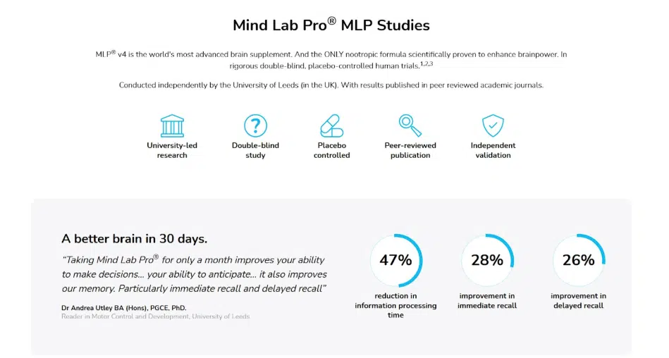
Source: mindlabpro.com
Meaningful Risk-Reduction Signals
Purchase anxiety peaks at the moment of commitment. Visitors who’ve read your entire page and understand your value can still bail because they’re worried about making the wrong choice.
Risk-reduction signals address this anxiety by showing people they have an exit route if things don’t work out. These signals work because they reframe the decision. Instead of “Should I commit to this forever?” the question becomes “Am I willing to try this with no real consequences?”
To achieve this:
- Embed reassurance directly into the flow of the page.
- Place it near pricing, plans, and primary CTAs.
- Use short, direct language. Avoid legal tone and long explanations.
- Focus on removing specific worries such as upfront fees, shipping costs, or long-term commitment.
- Keep the signals visible but calm. Pop-ups, banners, or helper text should support the decision, not interrupt it.
- Consistency matters too. Every reassurance should align with your broader brand message and customer experience. Empty guarantees erode trust fast.
Bay Alarm Medical, which sells personal emergency response systems, integrates risk reduction directly into their pricing page.
This page opens with “Not sure which one is right for you? Request a Free Consultation”, addressing uncertainty before it becomes paralysis. The main CTA reads “Get Your 15 Day Risk-Free Trial,” positioning the decision as exploration rather than commitment.
The page also triggers a pop-up that reinforces the page’s messaging with “15 Day Risk-Free Trial. No Activation Fees. Free Ground Shipping. Free Month of Service.” These are core selling points that neutralize fear exactly when it surfaces.
The approach works because it acknowledges legitimate concerns and resolves them immediately.
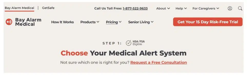
Source: bayalarmmedical.com
CTAs That Are Visible When the Reader Is Ready to Act
CTAs work best when they match the reader’s mental state. This respects intent instead of interrupting it.
Most visitors don’t act the moment they land on a page. They act after they understand the value, assess credibility, and feel ready to move forward. CTAs that remain visible during that process prevent lost momentum.
Design plays a direct role here. Larger CTA buttons reduce friction by making the action feel easier and more obvious. Testing across many websites shows that increasing button size can raise click-through rates by up to 90%. Bigger buttons stand out, feel intentional, and signal importance without needing louder language.
To achieve this:
- Treat CTAs as part of the reading journey.
- Use one clear message and keep it consistent across the page.
- Avoid rewriting the CTA for each placement.
- Introduce an early CTA for readers who already have intent, then support the rest of the content with a sticky CTA that stays visible as they scroll.
- Make sure it doesn’t block text or distract from reading.
- At the end of the page, repeat the same CTA to capture intent once the value is fully understood.
Investing.io shows this approach in action. The platform centers on discussions around investing, startups, and small business opportunities.
In their article on raising capital as an independent sponsor, the content focuses on process and persistence. A sticky CTA invites readers to join the community and stays present throughout the page. At the bottom, the same CTA appears again with the same copy and goal.
This structure supports readers while they learn and captures intent once they’re ready to act.
Source: investing.io
Dedicated Social Proof Pages
Social proof works best when it has space to breathe. Dedicated pages for reviews and testimonials help because they separate validation from persuasion.
This strategy delivers results because visibility and focus matter. When customer reviews sit behind a tab or get buried mid-page, many visitors miss them.
Sites that give reviews strong, intentional visibility often see conversion lifts of around 67%. A dedicated page removes distraction and doubt at the same time. Visitors who feel uncertain know exactly where to look for confirmation.
To achieve this:
- Gather reviews, testimonials, and ratings in one place instead of scattering them across the site.
- Use real names, locations, photos, or project details where possible. Specifics build trust faster than polished praise.
- Group feedback by service, outcome, or customer type to help visitors find stories that match their situation.
- Keep the layout clean and readable.
- Avoid long blocks of text and heavy decoration. This page should feel factual and grounded, not promotional.
- Most importantly, link to it clearly from high-intent pages like services, pricing, and navigation menus.
Brickface is a company that operates in exterior home improvement and repair, where trust plays a major role in hiring decisions.
Rather than loading their homepage with testimonials, they direct visitors to a dedicated customer reviews page. There, reviews and testimonials appear in one focused space. This reduces noise on the homepage while still giving prospects access to real customer experiences when they need them.
The result is a calmer experience supported by confidence-building proof, delivered at the right moment.
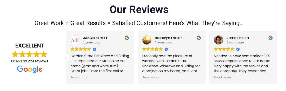
Source: brickface.com
Clear Comparisons and Transparent Pricing
Pricing creates hesitation when it feels incomplete or hard to decode. Clear comparisons reduce that hesitation by setting expectations early.
When pricing and scope stay visible and specific, decisions move faster. Brands that present prices in a clear, understandable way often see conversion gains of around 48% because fewer visitors stall or leave to “research later.”
Ambiguous pricing forces visitors to fill in gaps on their own, and they usually assume the worst. Transparent comparisons replace suspicion with orientation. They show respect for the buyer’s time and intelligence. Clear structure also prevents false equivalency, where two services seem interchangeable simply because the differences aren’t explained.
To achieve this:
- Put comparisons side by side. Tables work well because they let visitors scan and understand trade-offs quickly.
- Label differences plainly. Focus on scope, outcomes, timelines, and support, not marketing language.
- Show pricing alongside each option so visitors don’t have to hunt for it.
- If prices vary based on context, explain why and define the variables.
- Avoid footnotes that hide important details.
- Keep the layout calm and readable, with enough spacing to prevent overload. The goal is clarity, not persuasion through pressure.
R.E. Cost Seg, a firm that provides cost segregation studies for real estate investors to accelerate tax deductions, demonstrates this perfectly.
On their services page, they present a table comparing their two main offers. The table highlights differences in approach, depth, and pricing without framing one option as a trick or upgrade trap.
By clearly differentiating services and displaying prices upfront, R.E. Cost Seg helps buyers understand what they’re choosing. That transparency supports confident decisions and avoids the feeling of being steered or oversold.
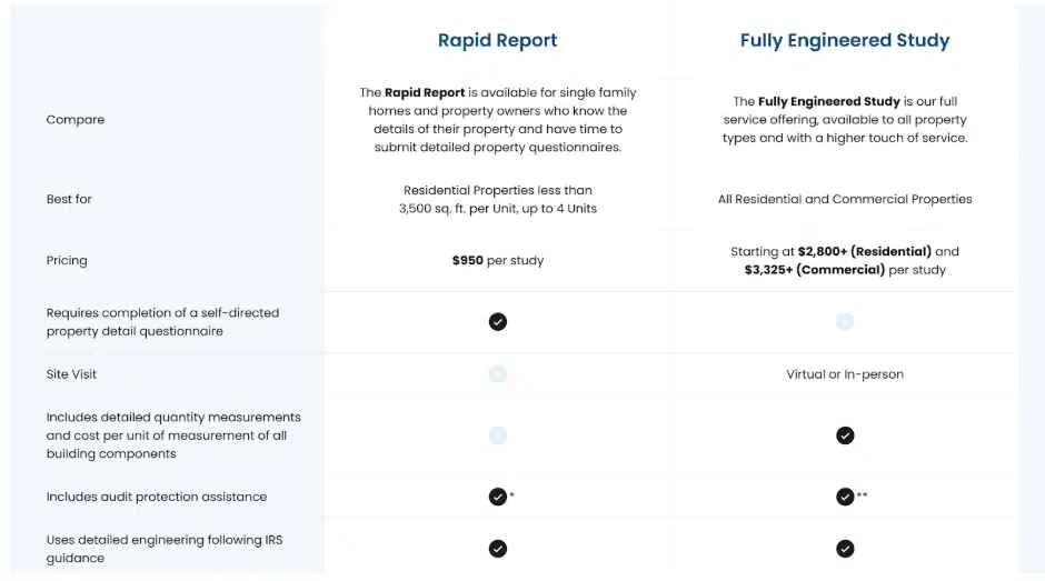
Source: recostseg.com
Visual Clarity Through Minimalist Layouts
Visual noise slows decisions. When too many elements compete for attention, visitors spend energy sorting instead of understanding.
Minimalist design works because it reduces cognitive load. White space gives the brain room to process information without strain. When elements feel distinct and intentional, people move through a page with less effort and more confidence.
This strategy benefits brand messaging by making it easier to absorb. Clear spacing highlights what matters and downplays what doesn’t. Headings read faster. CTAs feel easier to spot. Supporting details stay available without crowding the main message.
Instead of feeling pushed, visitors feel guided. That calm experience builds trust and keeps attention focused.
To achieve this:
- Start by removing before adding. Strip away decorative elements that don’t serve a purpose.
- Use white space to separate sections, not just to fill gaps.
- Give headlines room above and below so they anchor each section clearly.
- Limit the number of fonts and colors, and apply them consistently.
- Keep line lengths readable and avoid dense blocks of text.
Visual hierarchy matters more than visual flair. Design should direct the eye in a predictable order, from headline to explanation to action. Every element should earn its place on the page.
Notion provides a strong example of this approach. The platform serves individuals and teams who need a flexible workspace for notes, projects, and collaboration.
Their website reflects that same philosophy. Each section uses generous spacing, clear headings, and restrained visuals. Nothing feels rushed or cluttered. Content appears in a steady rhythm that guides visitors downward without confusion. Visuals support the message instead of competing with it.
This makes the design feel modern, polished, and easy to navigate. It demonstrates how thoughtful restraint in design helps users focus, understand, and move forward without friction.
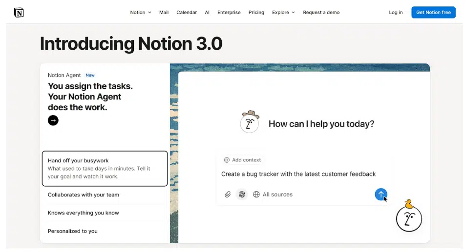
Source: notion.com
Final Thoughts
Reducing decision friction comes down to respect. Respect for attention, time, and how people actually decide online.
This friction costs you conversions every day. The longer you wait to address it, the more money you leave on the table.
So, start by auditing your highest-traffic pages. Identify where people hesitate or drop off, then apply the tactics that directly address those friction points. Test one change at a time so you know what works. Measure the impact, refine your approach, and move to the next friction point.
Your visitors already want what you offer. Your job is to stop getting in their way.

