Picture this: You walk into a grocery store and head straight for the cookie aisle (the best in the store, of course).
You arrive at the chocolate chip cookies with dozens of options pleading to hitch a ride in your cart to the checkout line. Which one do you end up purchasing?
Do you go with the crisp, modern packaging featuring textured images of cookies that make your mouth water? Or the one with dark, outdated packaging with nothing other than the cookie’s name displayed in ’90s bubble letters?
If both cookies are priced comparably, you’ll likely choose the one with the appealing packaging.
Why?
Research shows that 90 percent of the information transmitted to the brain is visual, so consumers tend to establish first impressions based on what they see.
Brand visual identity matters. It helps establish an edge over the competition by adding the “pick me” flair to your product or service, making you stand out from those without such branding elements.
If you want to establish yourself as a credible brand in your niche, lean into these three strategies to increase brand awareness, score new customers, and boost your bottom line.
Are you ready to learn more? Let’s dive in.
Understanding brand visual identity
A brand’s visual identity is its overall look and feels expressed through visual elements such as color, typography, imagery, and lines.
It includes the design of your brand’s logo and other graphic elements used consistently across various touchpoints, such as packaging, websites, social media, advertising, and other marketing materials.
A strong visual identity can help your brand stand out in the market, establish a clear and consistent message, and create a cohesive and professional appearance.
For instance, what do Tesla, McDonald’s, and Nike all have in common?
They are some of the most recognizable brands in the world and are easily identifiable based on a simple, timeless logo.
Your visual identity establishes your brand’s personality and values and helps customers recognize and remember your brand for future purchasing decisions.
With the basics out of the way, let’s dive into the meat and potatoes of how your brand’s visual identity can win over new customers:
1. Stand out from the crowd
Let’s face it, a crowded market is like a buffet at a Vegas hotel. Everyone is vying for attention, and it can be tough to stand out.
But don’t despair. Just like a fancy shrimp cocktail platter, a strong visual identity can make you the belle of the buffet. By creating a unique and memorable visual identity, you can make your brand stand out and catch the eye of potential customers.
Take a look at Airbnb, Lego, or Target—they all have visual identities that are easily recognizable and make them stand out from their competition.
Let’s be real. Standing out in a crowded market is like trying to find your car in a Walmart parking lot on Black Friday. It’s easier said than done.
But, just like bright pink fuzzy dice hanging from your rearview mirror, your visual identity can help you pop out of the sea of sameness. By creating a unique and memorable visual identity, you can make your brand impossible to ignore and catch the attention of potential customers.
So, don’t be afraid to go bold when creating your visuals and use a photo editor to enhance your content for max appeal. Soon you’ll be the one everyone is talking about and most importantly, buying from.
2. Build trust with your audience
First impressions are everything. You only get one shot, so make it count.
A consistent visual identity with the same colors, typography, and imagery, can make your brand more recognizable and memorable, kinda like a catchy jingle. Once it’s stuck in your head, you usually can’t get it out. But that’s what you want.
Another way to establish trust with customers is by aligning your visual identity with your values, just like someone is aligning their actions with their words.
For example, if your brand is environmentally friendly, make sure that’s a main part of your visual identity. It’s like a promise. If your actions align with your values, people will trust you more.
The same goes for a polished, well-designed visual identity. It can communicate that your brand takes itself seriously and instills customer trust. It’s like a business card. It gives off a vibe of professionalism and competency.
Take Samsara as an example. The company specializes in providing cloud-connected telematics software and high-quality video-based safety devices with award-winning technology. Their modern and professional brand identity is clearly reflected in their logo, color palettes, communications, and office designs across the world.

3. Use the power of emotion
As humans, we’re emotional beings. And we tend to trust and do business with brands that we have a connection to on an emotional level. That’s where you can differentiate yourself from your competition to win over new customers.
You see, by understanding the psychology of color and using it to your advantage, you can create a visual identity that evokes certain emotions.
For example, using blue can give off a vibe of trustworthiness and reliability, which makes people more likely to trust your brand. Trust can be especially important for businesses in industries like finance or jewelry insurance.
For example, BriteCo, a company specializing in this kind of service, uses a blue and green color palette with clean and minimalist typography and multiple images of diamonds. These elements are visible throughout their social media channels, creating a cohesive visual identity that’s easy to trust to protect your finest jewelry pieces.
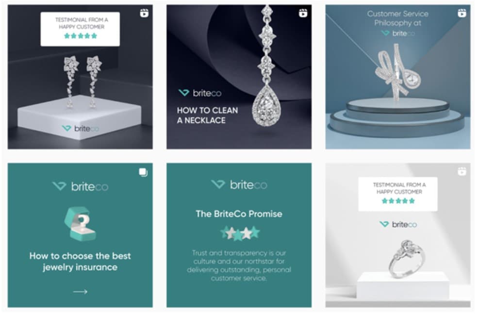
But it’s not just about the colors—the overall design should create an emotional connection with your target audience. If you’re able to create a design that resonates with people emotionally, it’s more likely to lead to a loyal customer base and drive sales.
After all, a bride would be heartbroken if anything happened to her beloved engagement ring (and it wasn’t insured). By making sure your branding aligns with your target audience and evokes the right emotions, you’re creating a strong emotional bond with your customers that can lead to greater success in the long run.
How to build a strong brand visual identity
You don’t have to be a professional marketer or graphic designer to understand the power of branding. You just need to know how to harness it.
Here are a few things to remember when building your brand visual identity:
Understand your brand and purpose
Brand identity is your brand’s overall personality, which includes your values, mission, and purpose. Your name, logo, and tagline can express the emotional and psychological connection between you and your customers.
Visual identity is a subset of brand identity and includes the visual elements representing your brand. These visual elements include your brand’s logo, typography, color palette, and other design elements that create a consistent look and feel.
You first need to iron out your brand identity to get to your visual identity.
Ask yourself these three questions:
- Values – What does your company stand for?
- Mission – What does your company seek to accomplish? \
- Vision – What does your company hope to achieve?
This level of awareness of your values, mission, and vision is the stepping stone for creating an authentic brand identity that resonates well with your target audience.
For example, Dentfix is a dental wellness brand that aims to remove the negative stigma around “Turkey Teeth” and modernize the idea of a healthy-looking smile.

Their mission is reflected in all aspects of the brand, from the trust-inspiring blue color palette to the website and logo. The design style is dependable and assured, just like the purpose of Dentfix is to restore your face with its natural allure.
Use color psychology to your advantage
Color plays a huge role in building brand reputation and trust, and choosing them carefully and strategically is important—rather than picking a shade of blue that you think looks cool.
Color psychology studies how colors can affect people’s emotions and behaviors, and you can use this knowledge to build a solid visual identity.
For example, the visuals of the company Hims, which is known for selling sildenafil online, always evoke the association of cleanliness and tranquility, which instills trust and pleasant feelings in consumers.
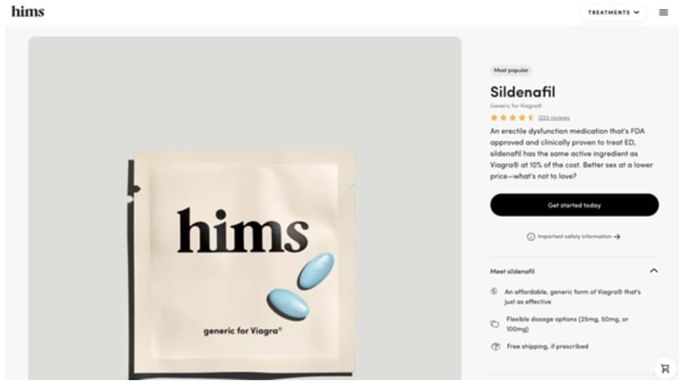
Here are a few more examples of how colors affect your branding choices.
- Red can evoke excitement, energy, and power, making it well-suited for fast-food, retail, and technology brands.
- Blue aligns with trust, calm, and stability, making it a good choice for banks, insurance companies, and healthcare brands.
- Green can indicate health, growth, and tranquility, used by brands in the natural or organic food industry or eco-friendly and sustainable products.
There are plenty of examples of SaaS companies that prefer sharp and brightly colored logos to make them easy to spot and remember. But just because other companies are doing something doesn’t mean you need to jump on the bandwagon.
As the saying goes, it’s better to measure twice and cut once to ensure you choose colors that align with your mission and values before you go all in on flamingo pink.
Focus on the main design elements
The design elements are the building blocks for creating a visual composition for your brand’s visual identity.
These elements include:
- Color: the visual element used to create contrast, emphasize, and draw attention to design elements. Colors can evoke emotion, create depth, and unify design elements.
- Shape: the basic building blocks of visual design. Different shapes communicate various messages and create visual interest.
- Lines: lines help separate elements, create movement, and define space.
- Texture: adds depth and complexity to a design by creating visual interest.
- Typography: the art of arranging type and is a powerful tool for communicating a message.
- Space: the area between and around design elements. Properly using white space can help create a sense of harmony and balance.
- Balance: the visual weight of elements in a design. Properly balancing design elements can help create a sense of harmony and visual flow.
Combine these elements to create a visually appealing design that conveys a message that aligns with your brand identity.
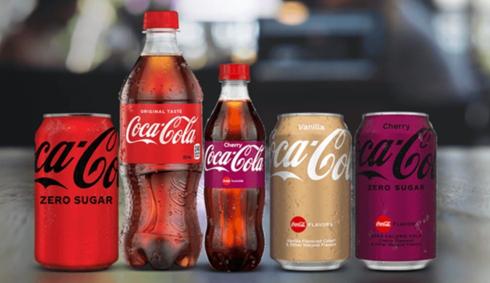
Coca-Cola is known for its distinct red color and use of white cursive typography, and the iconic imagery of its brand, like the Coca-Cola bottle shape, has become synonymous with the company’s name.
On the other hand, Apple is known for its simple and clean aesthetic, often using white space and minimalistic design in its product packaging and marketing materials. The apple with a bite missing has become one of the world’s most recognizable logos.

Consistency is key
As with many things in the business world, consistency is the name of the game.
- Posting consistently on social media will boost your following.
- Sending consistent cold emails will bring in new leads.
- Using consistent colors, logos, and typography across your packaging, website, and marketing materials will build brand recognition.
Think of it this way: you want customers to be able to pick your product out of a lineup, even if they’re just catching a glimpse of it in passing.
Using the same colors, typography, and design elements across all of your marketing materials makes it easy for customers to recognize and remember your brand. It creates a sense of familiarity, which is important for building trust and loyalty with your target audience.
For example, suppose a cleaning brand wants to position itself as an eco-friendly and natural product. In that case, the package should reflect this with colors, imagery, and typography that align with this message, regardless if it’s selling floor mat cleaner or dish soap.
Seventh Brands consistently uses a green leaf against a crisp white or transparent background across all the products (and packaging) they sell.

That way, when you are wandering around the store looking for the floor mat cleaner in one section of the store and the dish soap in another, you can quickly identify it.
If the brand changes its look, customers won’t be able to remember the brand when making a purchasing decision.
Creating a cohesive identity around your brand is considered part of your branding assets. It adds value to your company if you decide to sell the company down the road or bring on investors.
Wrapping up
A strong visual identity for your brand helps make a lasting impression on potential customers.
A timeless logo, eye-catching visuals, and a tug on the heartstrings can all help make your brand memorable and attractive to new customers. But remember that your visual identity should always reflect your core values and stay true to your brand.
Add the right design elements as the cherry on top, and you’ve unlocked the secret sauce to visual branding that no consumer can resist.


