

Data is a crucial part of every business. Finding the value in data and presenting that to your target audience in an interactive way requires effort.
Simply presenting spreadsheets isn’t enough to convince stakeholders of the value that data brings to the table. But when data is presented as a story, it’s easier for people to understand its importance and react accordingly.
That’s the power of data-based storytelling.
“Numbers have an important story to tell. They want you to give them a clear and convincing voice”, said Stephen Few, a data visualization expert.
If data is neither understood nor convincing, no one will act on it, and nothing will change. So what will bring about the change? Stories.
People love stories. Storytelling is a powerful technique to educate, explain, and influence a targeted audience or desired action. Plus, visuals are much easier to digest than a document full of numbers.
In the article, we’ll discuss why businesses are turning to data visualizations to communicate stories and how you can do that, too.
Understanding data visualization
Data visualization is the process of turning raw data into visual representations. Generally, those visualizations are in the form of graphs and charts.
Infographic data visualizations make data easier and faster to understand, even for people who aren’t typically good with numbers.
“An excellent visualization expresses complex ideas with clarity, precision, and efficiency,” said Edward Tufte.
A great visualization also tells a story through graphical representations. You can create beautiful graphics, statistical graphics, or basic charts for interactive data visualizations.
Visualization, in its educational or informational role, is actually a dynamic form of persuasion. Some communications are as persuasive as a compelling narrative.
So, create a visualization that tells a story to the audience. For instance, storytelling with infographic data visualization helps the viewer gain insight from the data.
According to a recent study, data storytelling has already become a popular tool for organizations, with 48 percent of marketers creating data visualizations weekly.
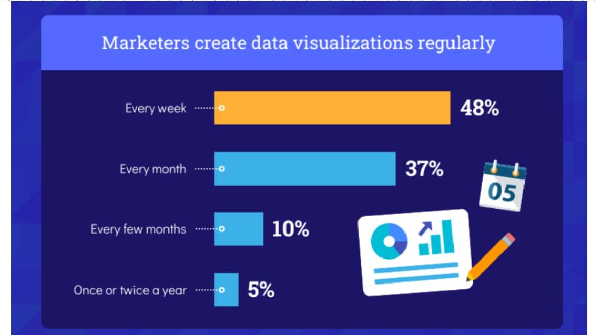
Image Source: Venngage
Benefits of data visualization
Data visualization has plenty of benefits. It transforms data into actionable insights, speeds up the decision-making process, identifies patterns and trends, and ultimately boosts your revenue.
As humans, our brains are programmed to think visually. They can process visuals 60,000 times faster than plain text. Moreover, a human brain can process an image in about 13 milliseconds.
That’s how a visual can be powerful to tell a story—via a graph, chart, or any other visual. Data visualization lets us absorb large amounts of data with a quick glance.
Plus, visualizations help us make data-based decisions faster. According to the Wharton School of Business study, data visualization increases the ability to reach consensus and decision-making by 21 percent.
In short, data visualization is mostly about helping decision-makers find the right information to make the right business decisions quickly.
Types of data visualization
Infographics are a common form of data visualization. In fact, high-quality infographics are 30x more likely to be read than regular text.
That’s one of the many reasons marketers and PR professionals use these images to convey information. Infographics are also easy to share, expanding your reach and driving positive search engine optimization (SEO) signals to your content.
Aside from infographics, the most common types of charts, graphs, and visuals include:
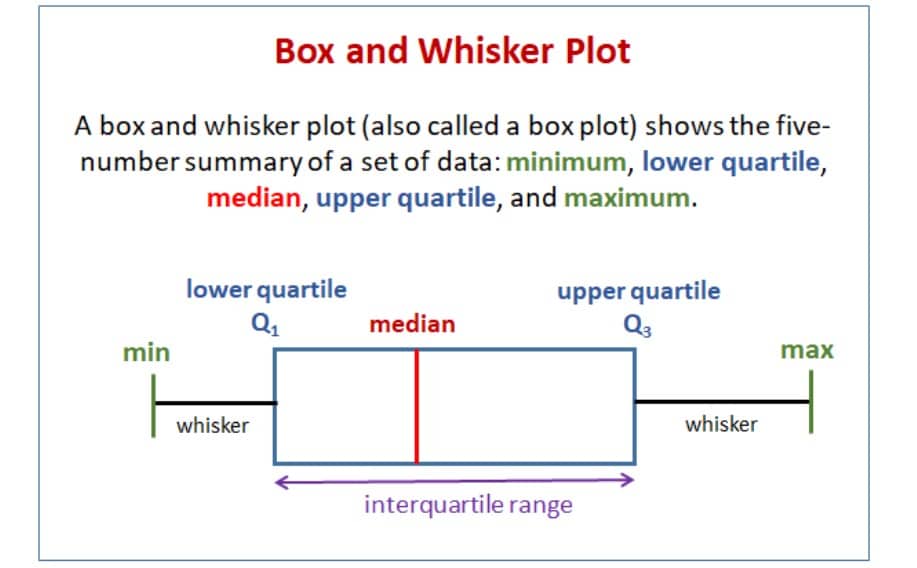
Box-and-whisker plots
Also known as box plots, these are graphical representations of data that display the distribution and spread of a dataset. They show the median, quartiles, and possible outliers, making comparing the distribution of different data sets useful.
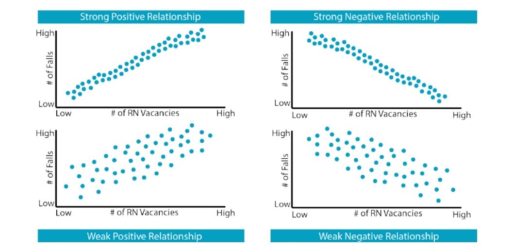
Scatter or dot plots
These are used to visualize the relationship between the two variables. These are effective for showing correlations and trends.
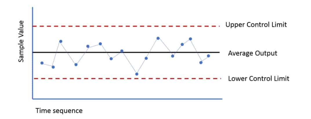
Control charts
Used to monitor and display variations in a process to show quality control and performance trends in infographics.
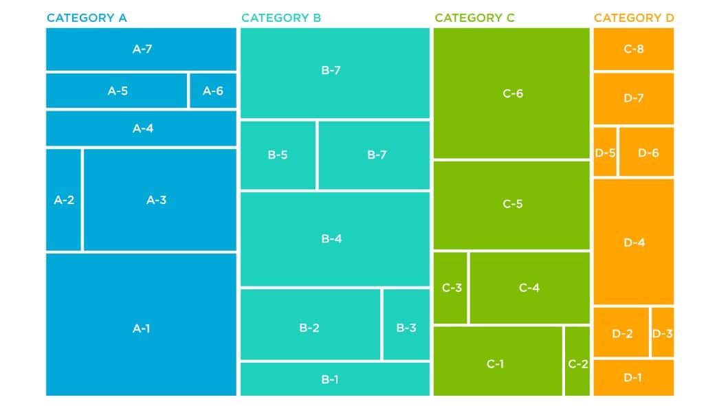
Treemap charts
They’re used to represent hierarchical data and are excellent for visualizing the composition of data categories, making it easier to make data comparisons in infographics.
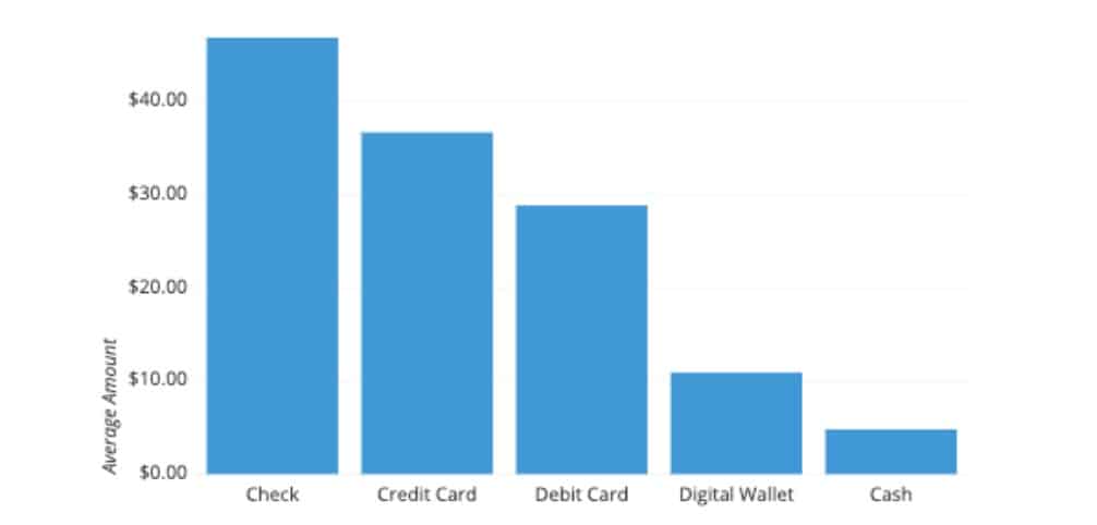
Column charts
They compare data categories using vertical bars, making it an effective choice to present data comparisons.
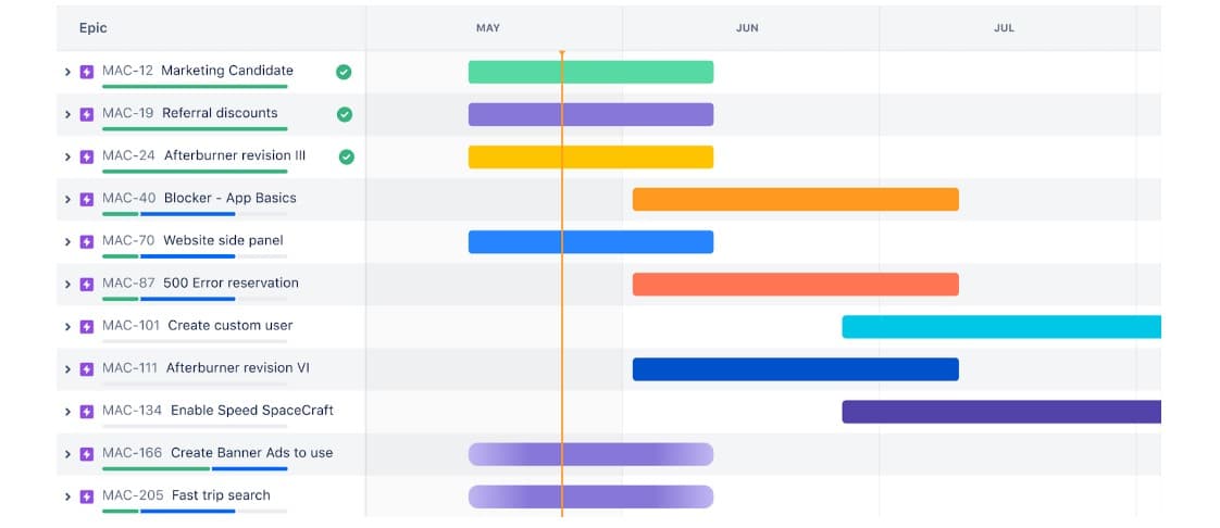
Gantt charts
These display project schedules, timelines, and task dependencies, making it easier to illustrate project plans and progress.
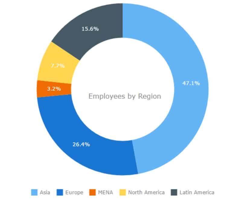
Donut chart
A variation of a pie chart, showing the compositions with the hole in the center, is mostly used to represent data proportions or percentages.
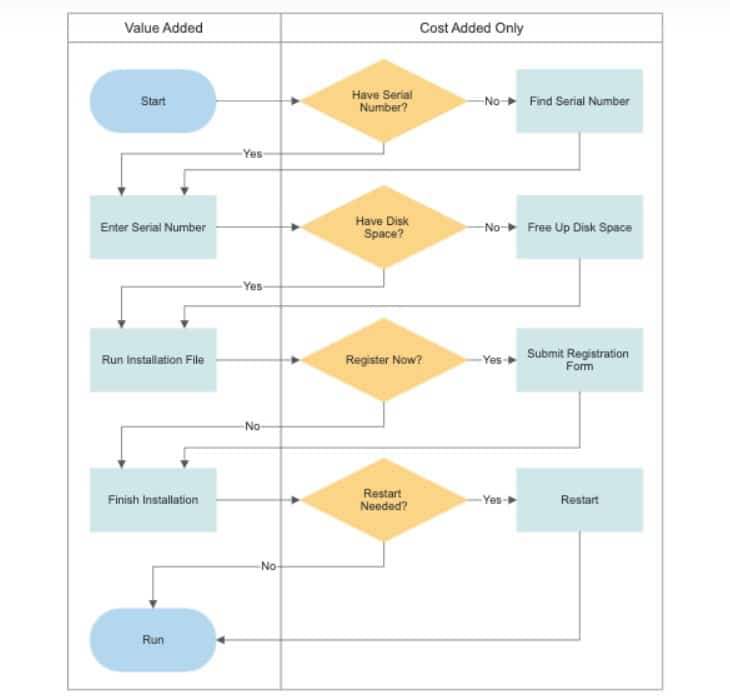
Flowcharts
These represent processes or systems using symbols and arrows, helping viewers understand step-by-step workflows and decision paths.
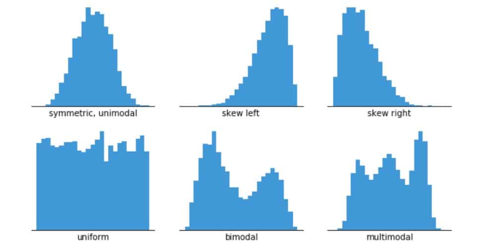
Histograms
Displays the distribution of numerical data to represent data patterns and frequency in infographics.
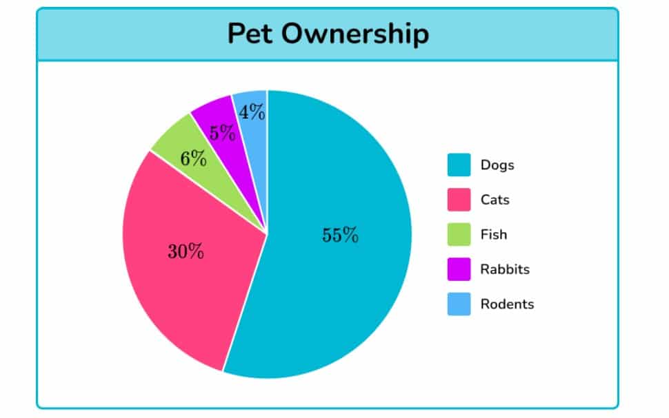
Pie charts
Presents data in a circular form and shows the relative proportions of data categories and the composition of a whole in infographics.
Heatmaps
A heatmap is a data visualization technique that uses color coding to represent different values or magnitudes in a dataset. Typically, warmer colors indicate higher values, and cooler colors indicate lower values.
In the context of storytelling, heatmaps effectively communicate complex data patterns and trends at a glance, making them especially useful for highlighting specific areas of interest or anomalies on web pages.
14 Tips to use data visualization and infographics to communicate stories
Use these simple tips to help you turn raw data into compelling stories that resonate with your target audience.
1. Define your story
Start with a crystal-clear core message. What’s the big revelation or insight your data unveils?
Think of your data as a narrative hero, setting out to enlighten and engage. Ask yourself: What do I want my audience to remember and act upon?
The goal is to pinpoint your key insights or takeaways and build your narrative around it
2. Gather and organize data
Your data’s credibility hinges on its accuracy and organization. Sloppy data leads to sloppy stories.
Invest time in ensuring your data is clean, reliable, and relevant. Consider using tools to help you automate data entry tasks for you. Effective preprocessing is the bedrock of your story’s authenticity. It sets the stage for an engaging and trustworthy narrative.
3. Know your audience
Who are you telling your story to? Your audience’s interests, expertise, and expectations shape how they perceive your data.
Personalization is key. For a novice audience, simplify. For experts, dive deep. It’s like being
The more tailored your story is, the more it resonates with the intended audience.
4. Choose the right visualization type
Selecting the right visualization is like choosing the right lens for a camera—it brings your subject into focus.
Bar charts, line graphs, and pie charts each tell a different story.
5. Create a narrative structure
Structure your data like a classic story—with a beginning, middle, and end.
Edward Tufte once said, “Above all else, show the data.”
But remember, showing data effectively means weaving it into a narrative. Start with an introduction, present the data with clarity and context, and conclude with a meaningful insight.
6. Incorporate storytelling techniques
Use narrative elements—like characters (personas), conflicts, solutions, and conclusions—to give your data a relatable context. This approach transforms cold facts into stories that touch, teach, and inspire.
Think of your data as characters in a novel, each with a role to play in your narrative’s journey from conflict to resolution.
7. Use color and design wisely
Colors and design are your allies in making data approachable and engaging.
Choose a color scheme that reflects your brand and enhances readability.
Just look at the example below—their visuals on social media are informative and aesthetically pleasing. They leverage purple to match their brand identity to capture attention on a crowded timeline.
Using contrasting colors (white font against a purple background) makes complex information about how to afford community colleges more accessible and easier to digest.

Remember, good design accomplishes two things. It looks good, and it enhances understanding.
8. Provide context
Without context, data sets are blocks of numbers. Context breathes life into your data, making it relevant and meaningful.
Use captions, annotations, and explanations to tell the story behind the numbers. This is where your narrative takes shape, turning raw data into a story with depth and dimension.
Think of it as giving your audience a guided tour through your data landscape.
9. Add infographics
Infographics are the bridge between data complexity and audience comprehension. They combine visual appeal with concise information, making even the most complex data digestible.
Include icons, illustrations, and minimal yet impactful text. The goal is to present a full story at a glance—an informative, visually engaging snapshot that speaks volumes.
You can find an excellent example on this dog health insurance landing page. They use infographics to turn statistics into compelling, customer-focused narratives.
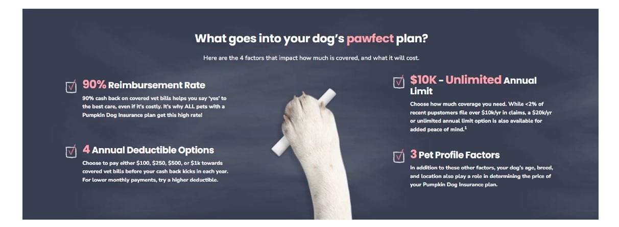
This choice of visualization helps illuminate the data, making complex ideas digestible and engaging.
10. Interactive elements
Adding interactive elements to your data presentation invites your audience to dive deeper.
Tools like quizzes, sliders, and filters turn passive viewers into active participants. The goal is to create a two-way conversation with your data, where exploration leads to discovery and greater understanding.
11. Cite sources
Always cite your sources. Your audience needs to know where your data comes from to believe in the story it tells.
Think of citations as the references in a well-researched book, adding depth and reliability to your narrative.
12. Use data storytelling tools
Harness the power of tools like Venngage to create compelling visual narratives, ThoughtSpot, Tableau, Adobe Illustrator, and Canva to bring your data stories to life.
These data analytics tools offer a canvas for your creativity, transforming raw data into visual masterpieces—without taking on too much heavy lifting.
13. Testing and editing
Great storytelling is an iterative process. Test your visualizations with a sample audience, gather feedback, and refine them. That’s where good stories become great—in the editing room.
Your audience’s insights are invaluable in honing clarity, effectiveness, and engagement. Think of it as a dress rehearsal, ensuring your story is ready for the main stage.
14. Distribution and promotion
Your story deserves an audience. Share and promote your visuals across multiple channels, including social media, email marketing, and your website.
Each platform offers a unique stage for your story to shine. Visibility is as crucial as the story itself. So, light up the digital skyline with your data story—make it visible, make it viral, and make it matter.
Final thoughts
In a world brimming with information, the ability to turn data into compelling narratives as a PR professional is invaluable.
By harnessing the power of data visualization and infographics, you can present complex information in an engaging, digestible format that captures your audience’s attention and drives the message home.
Whether it’s shaping public opinion, demonstrating the impact of a campaign, or simply conveying the value of a product or service, data storytelling enables you to communicate with clarity, credibility, and impact.
Mastering data storytelling via infographics helps you make every data point a part of a larger, more compelling story.

